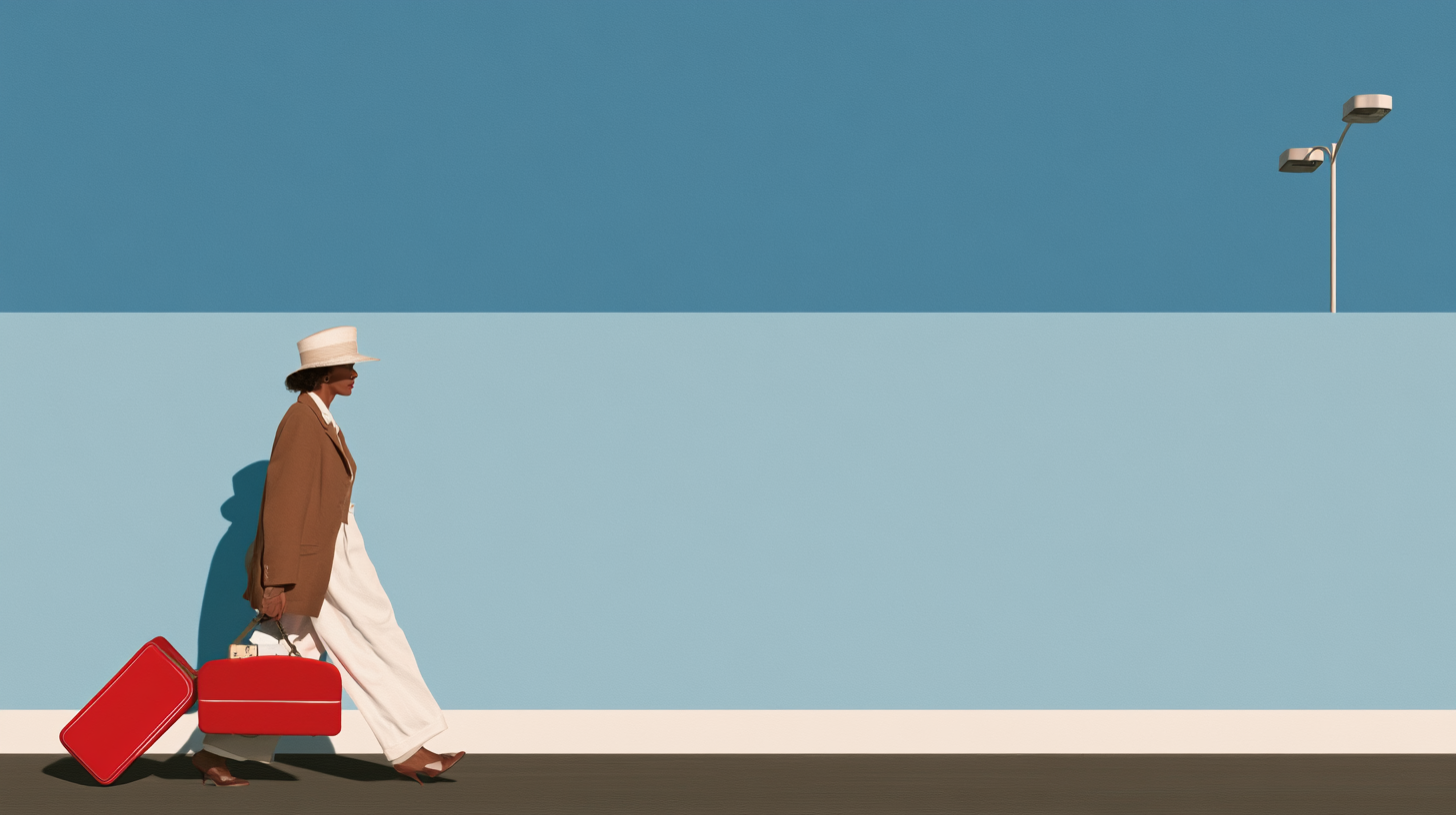
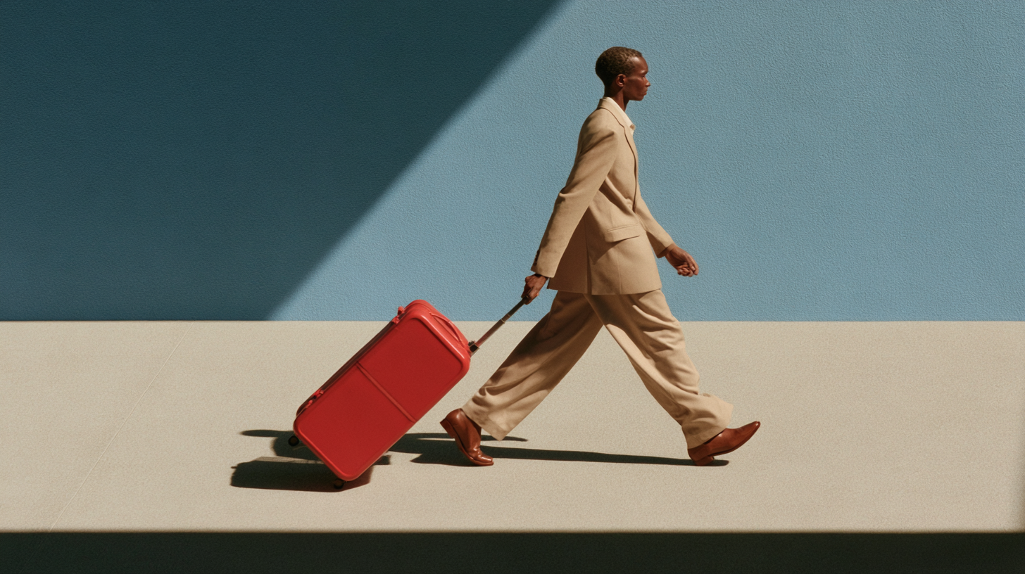
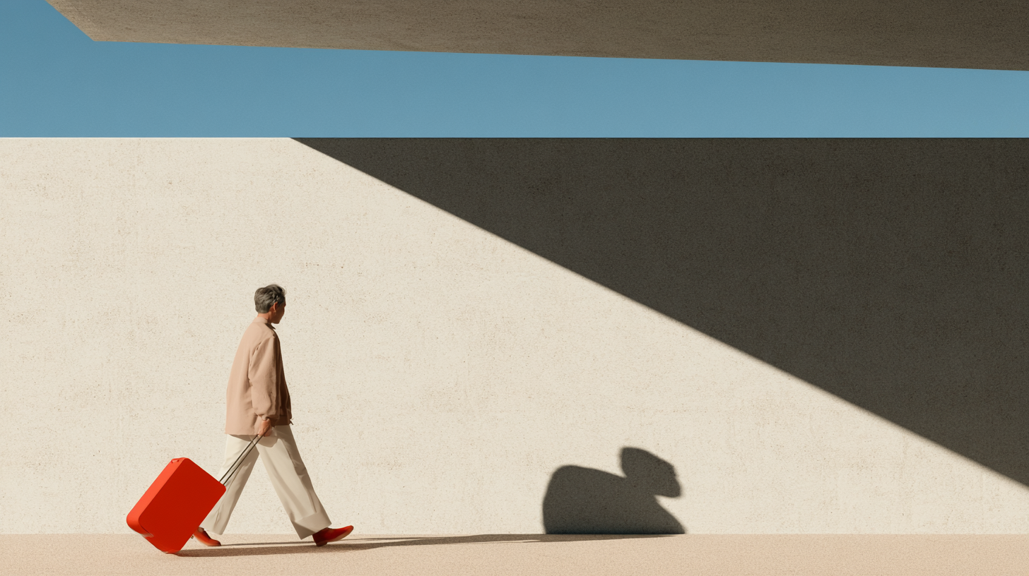
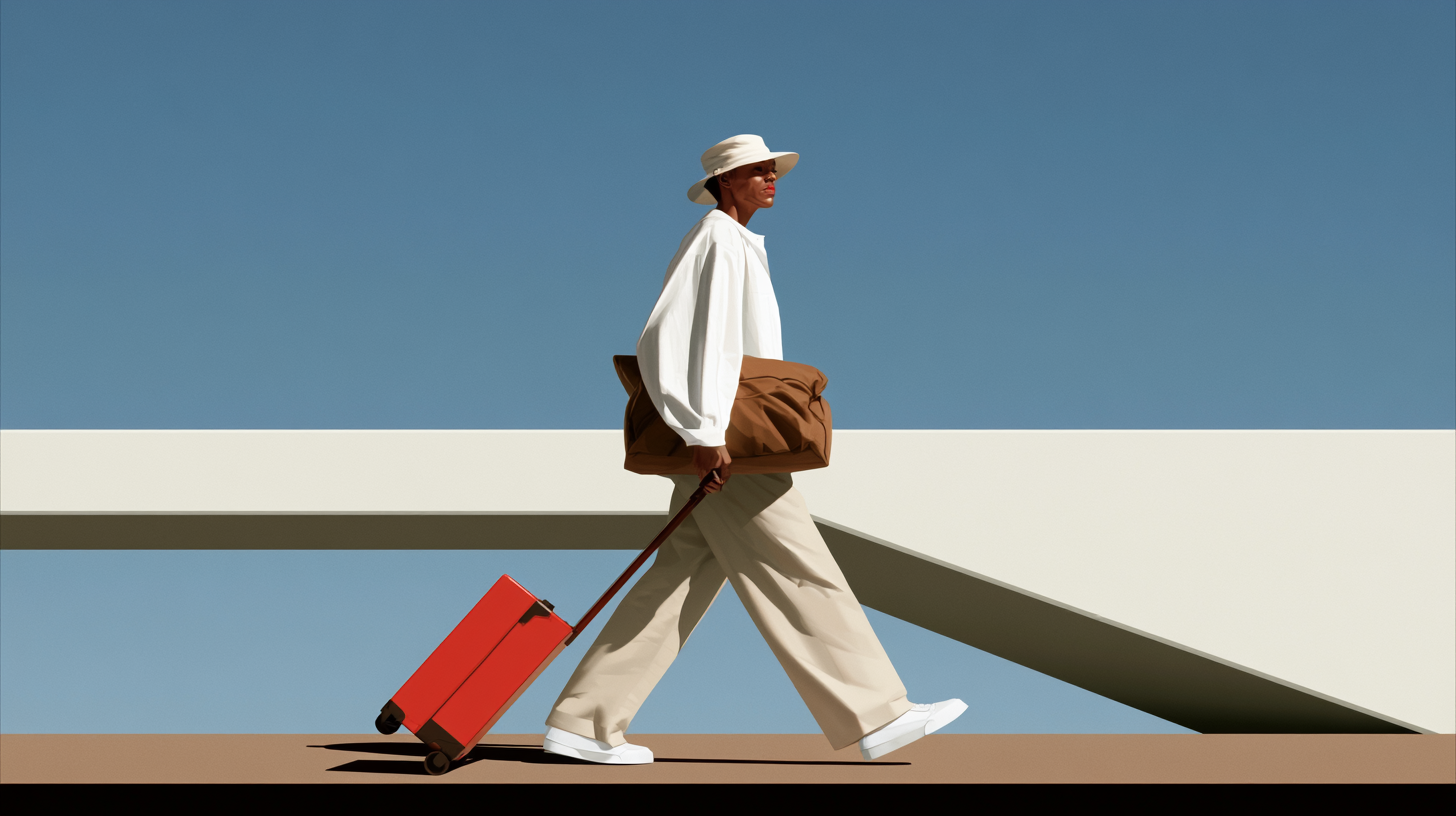
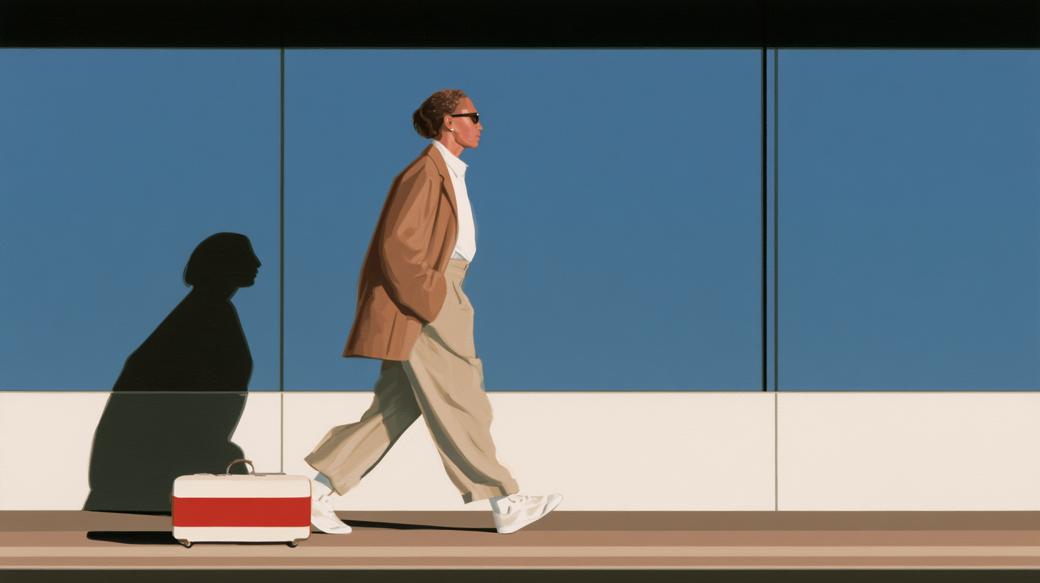
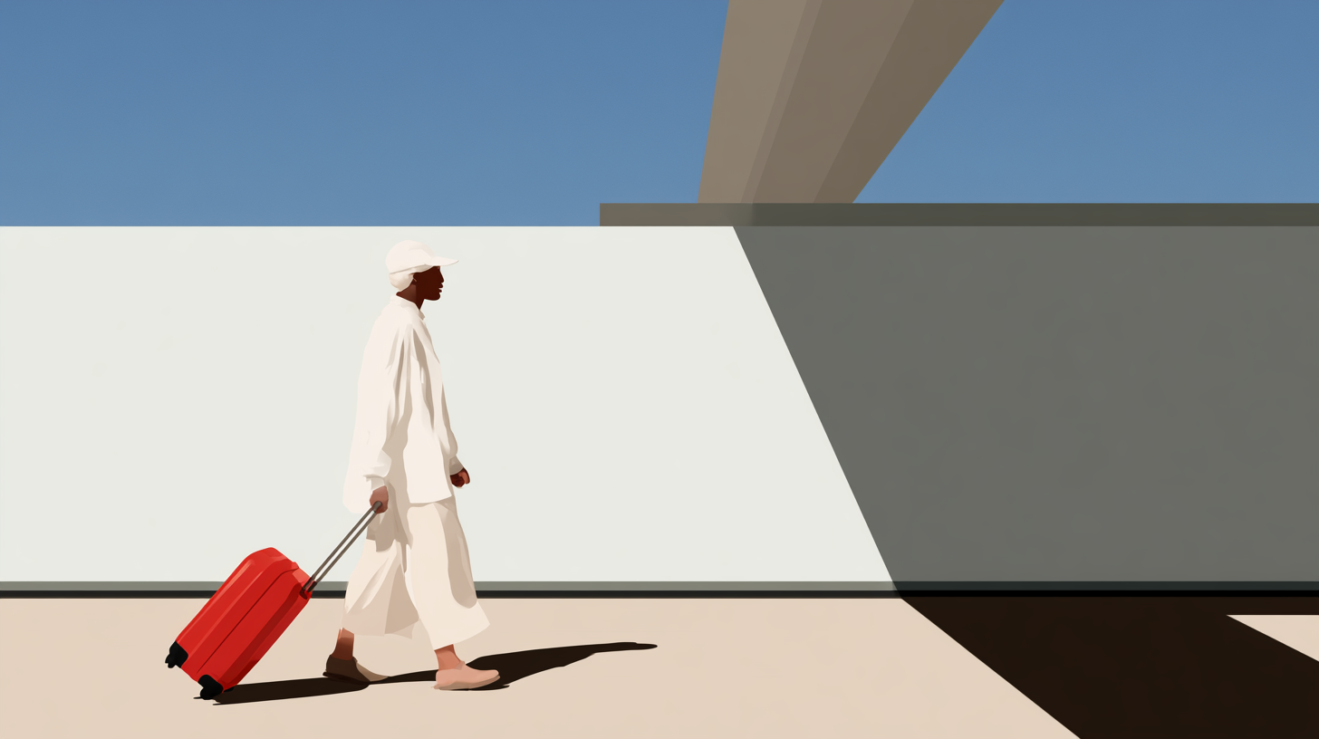
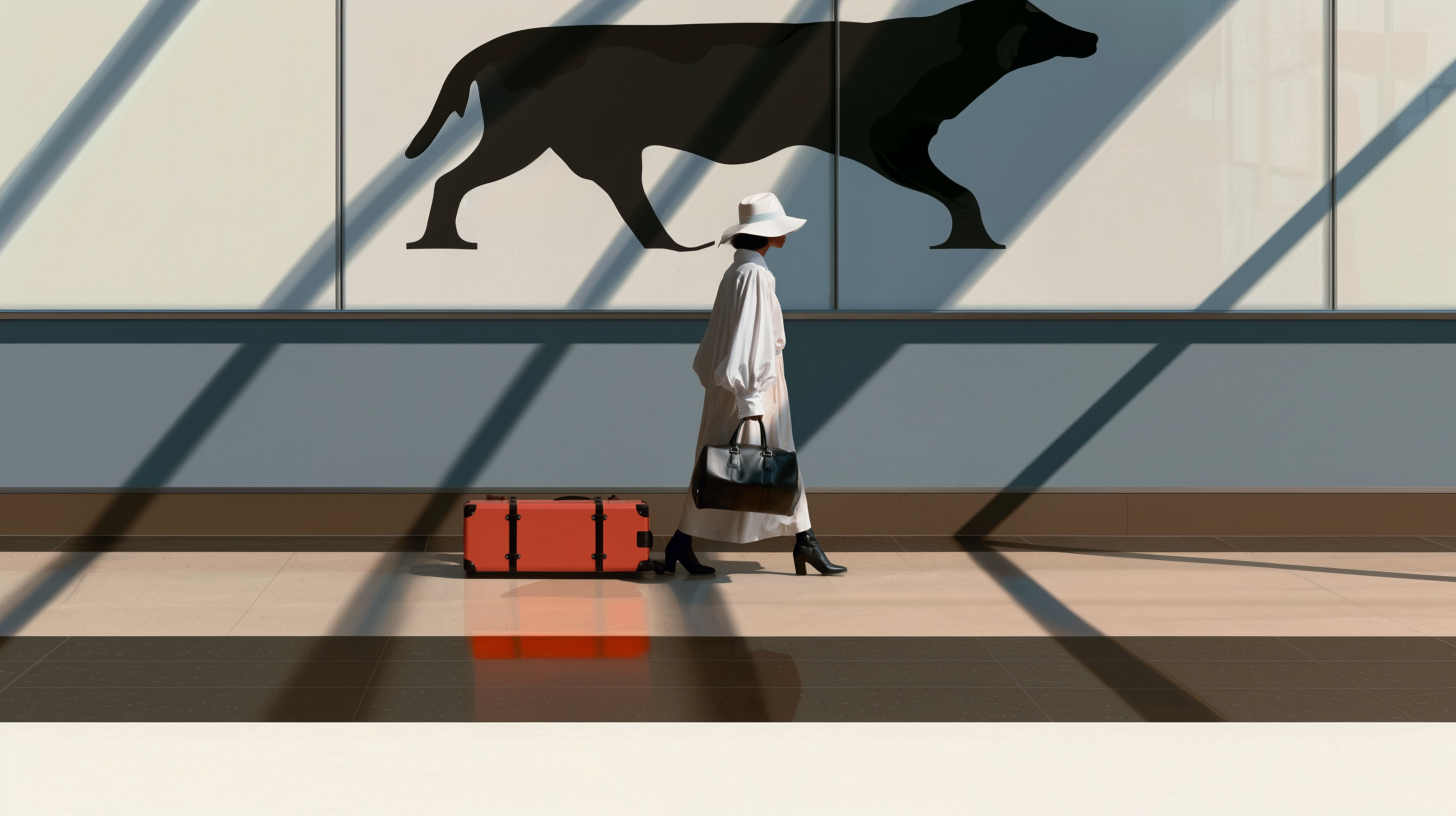
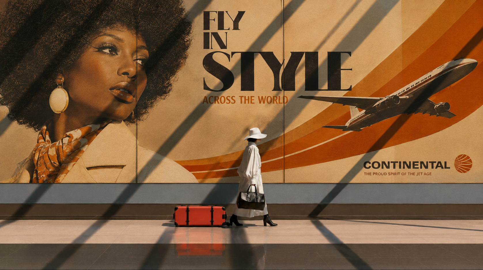
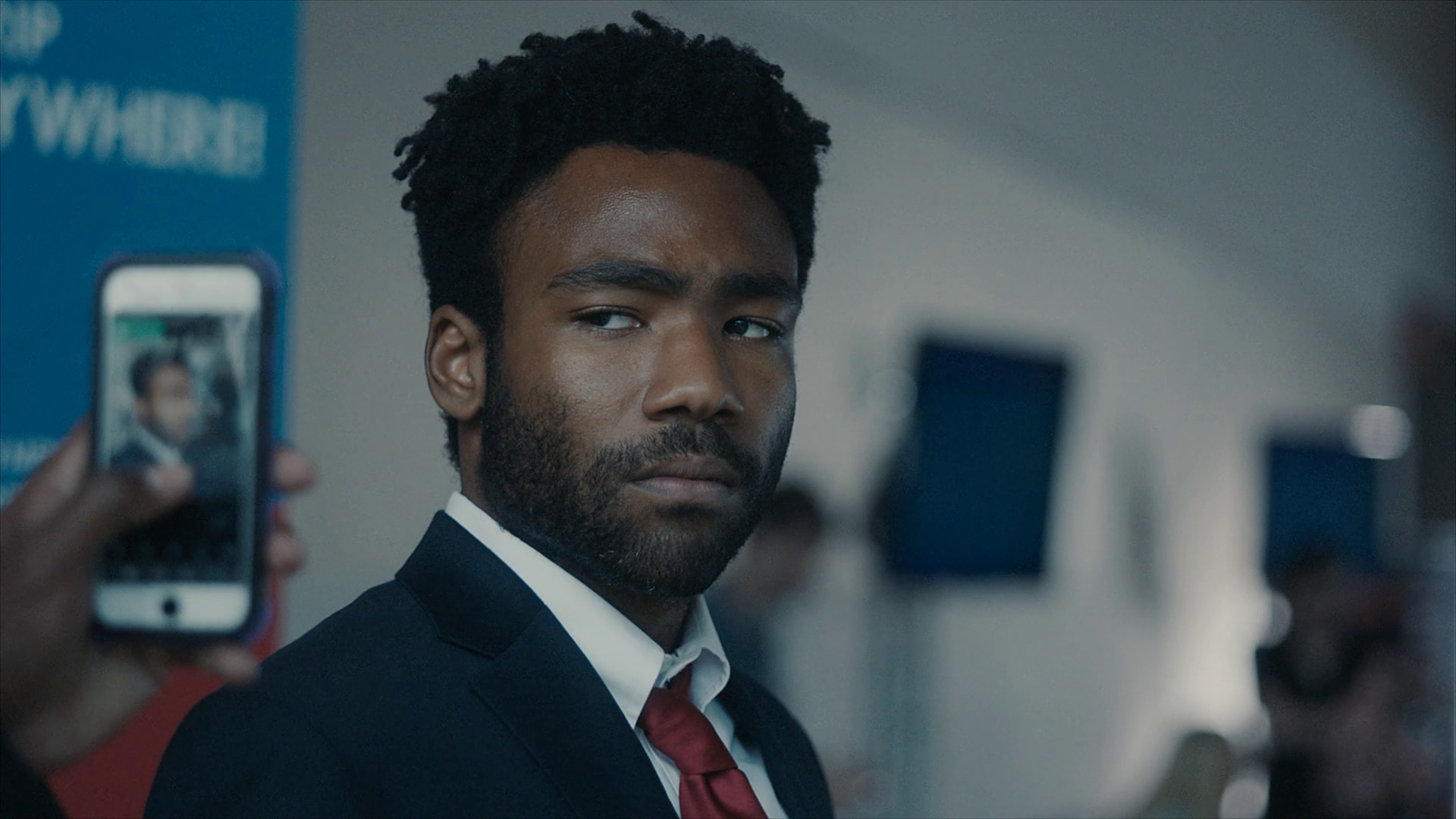
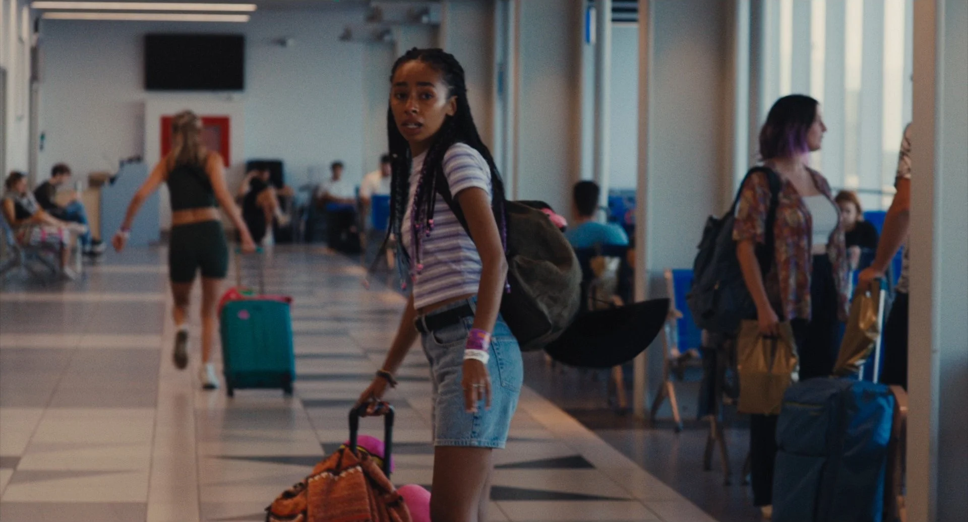
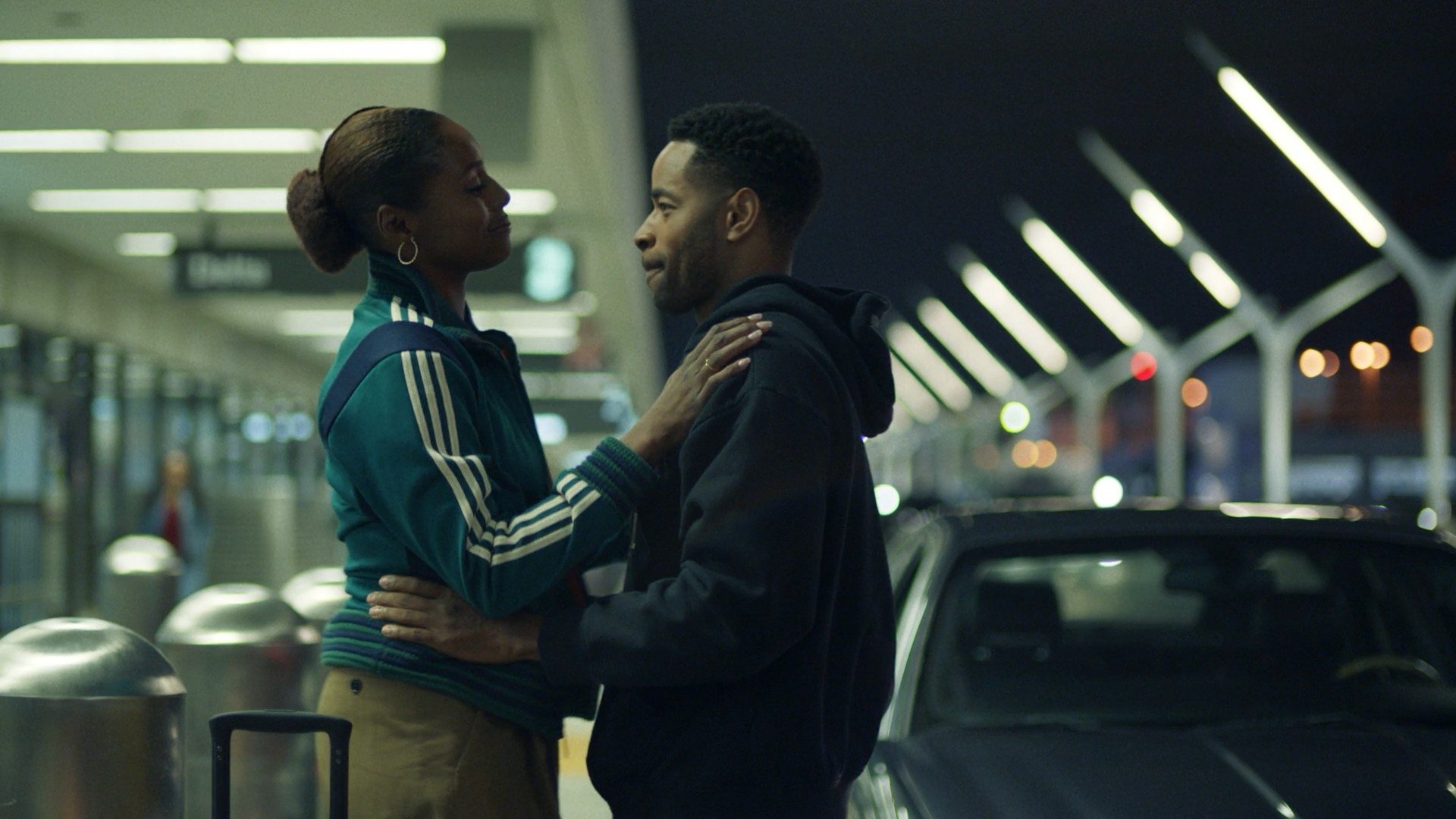
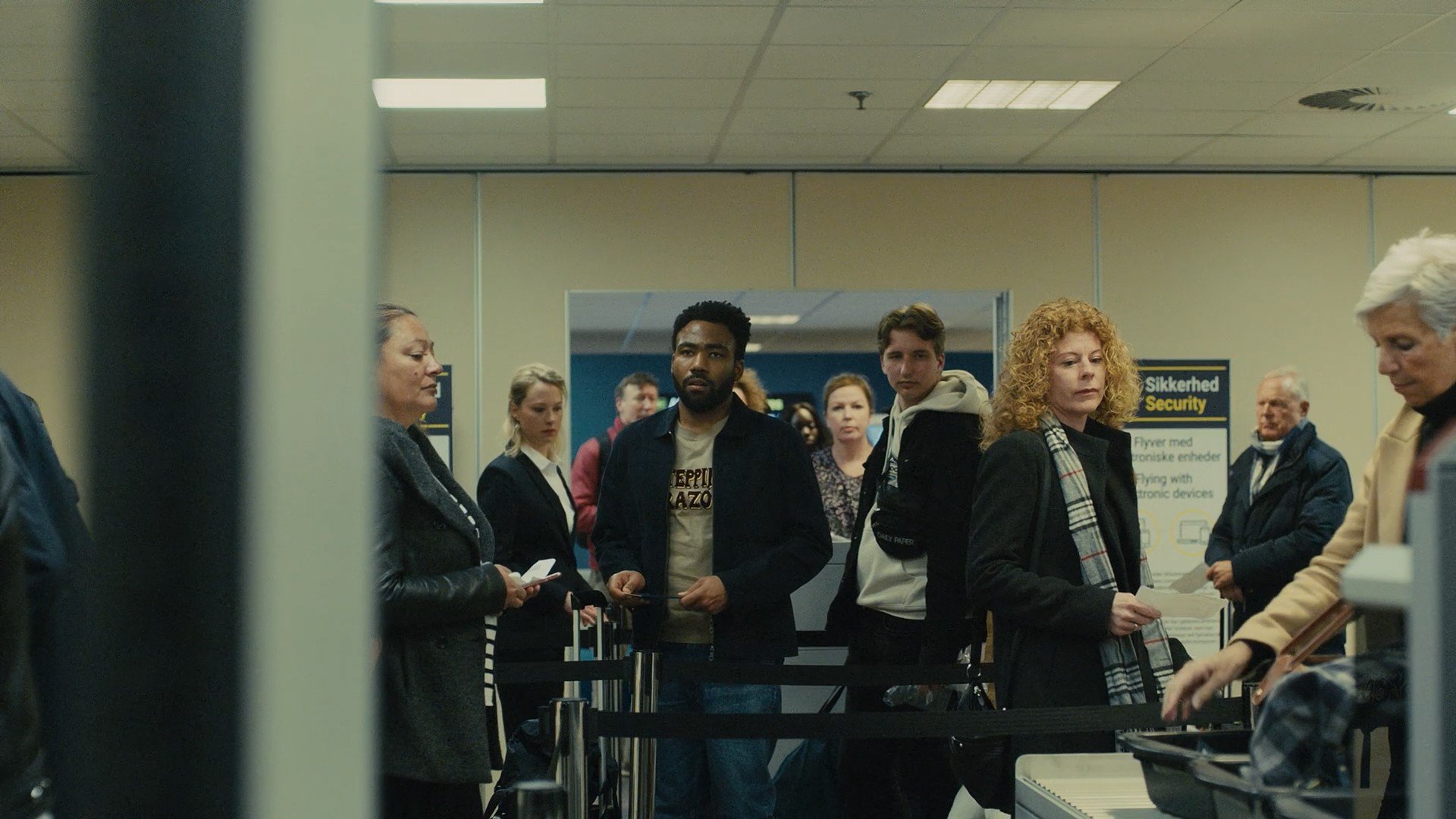
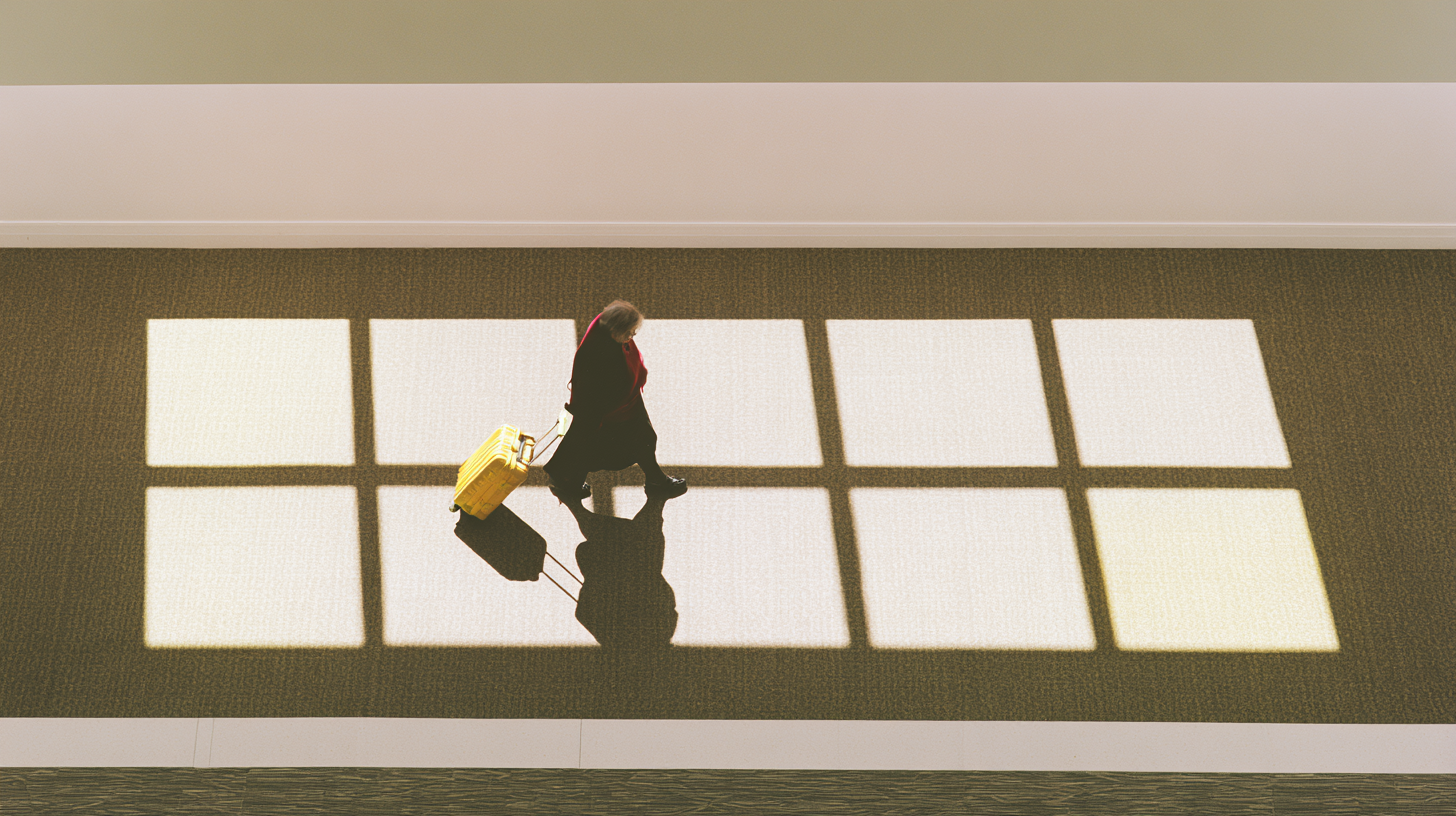
AIRPORT MOVIE
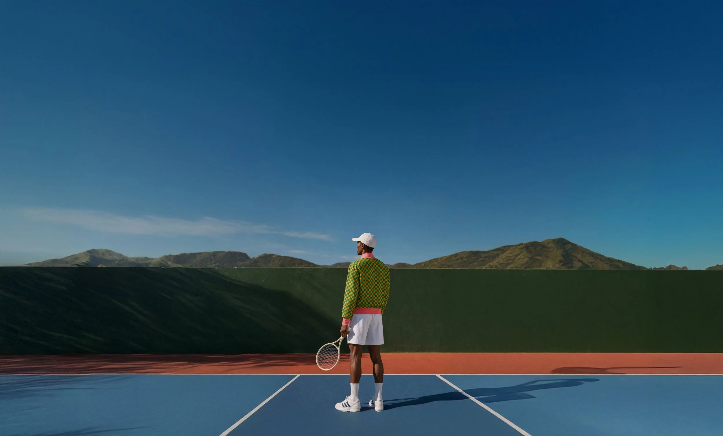
STYLE
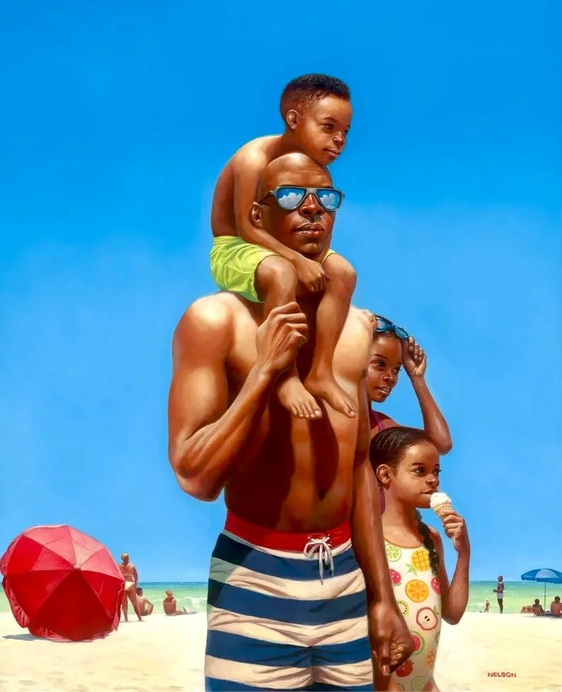
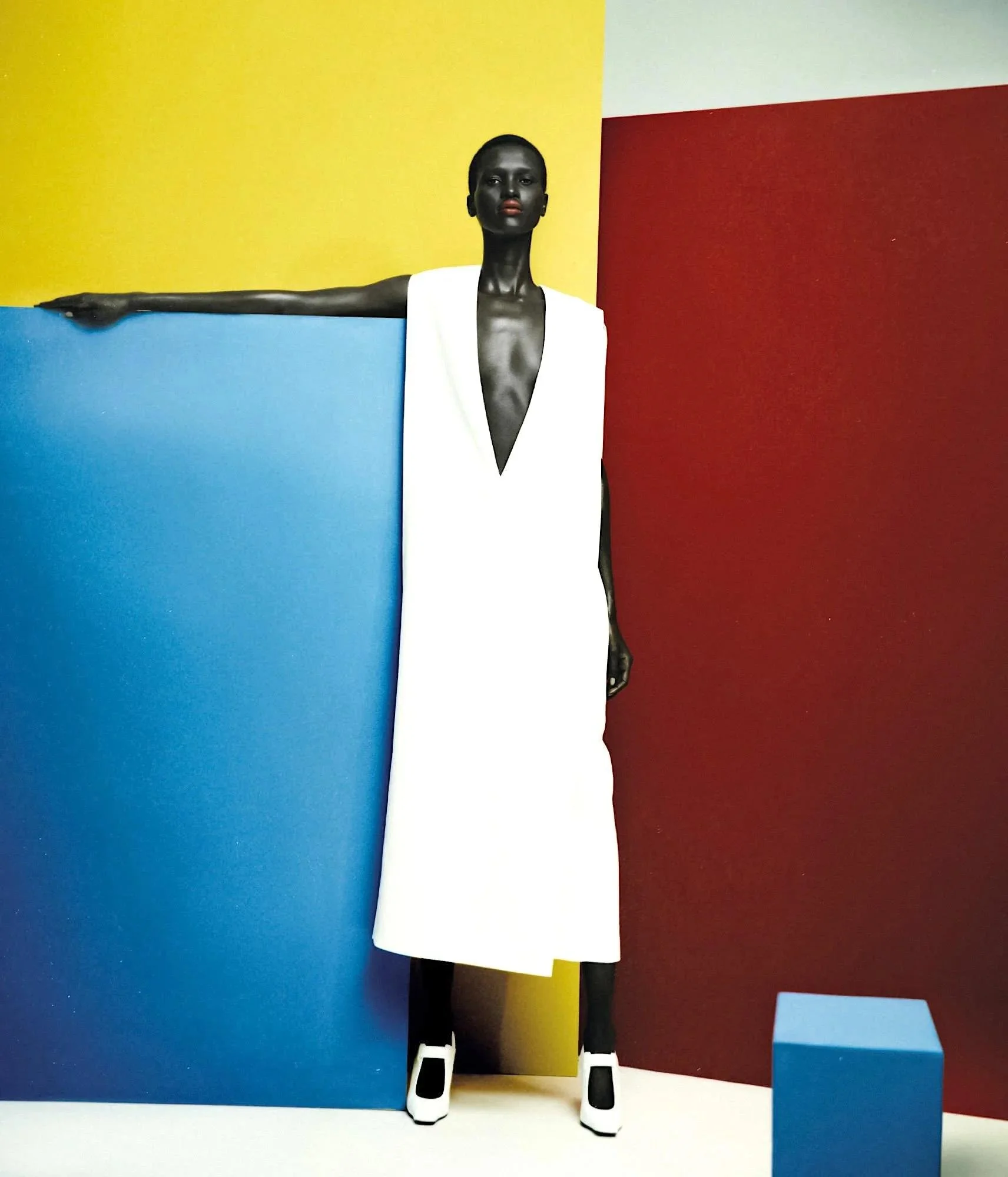

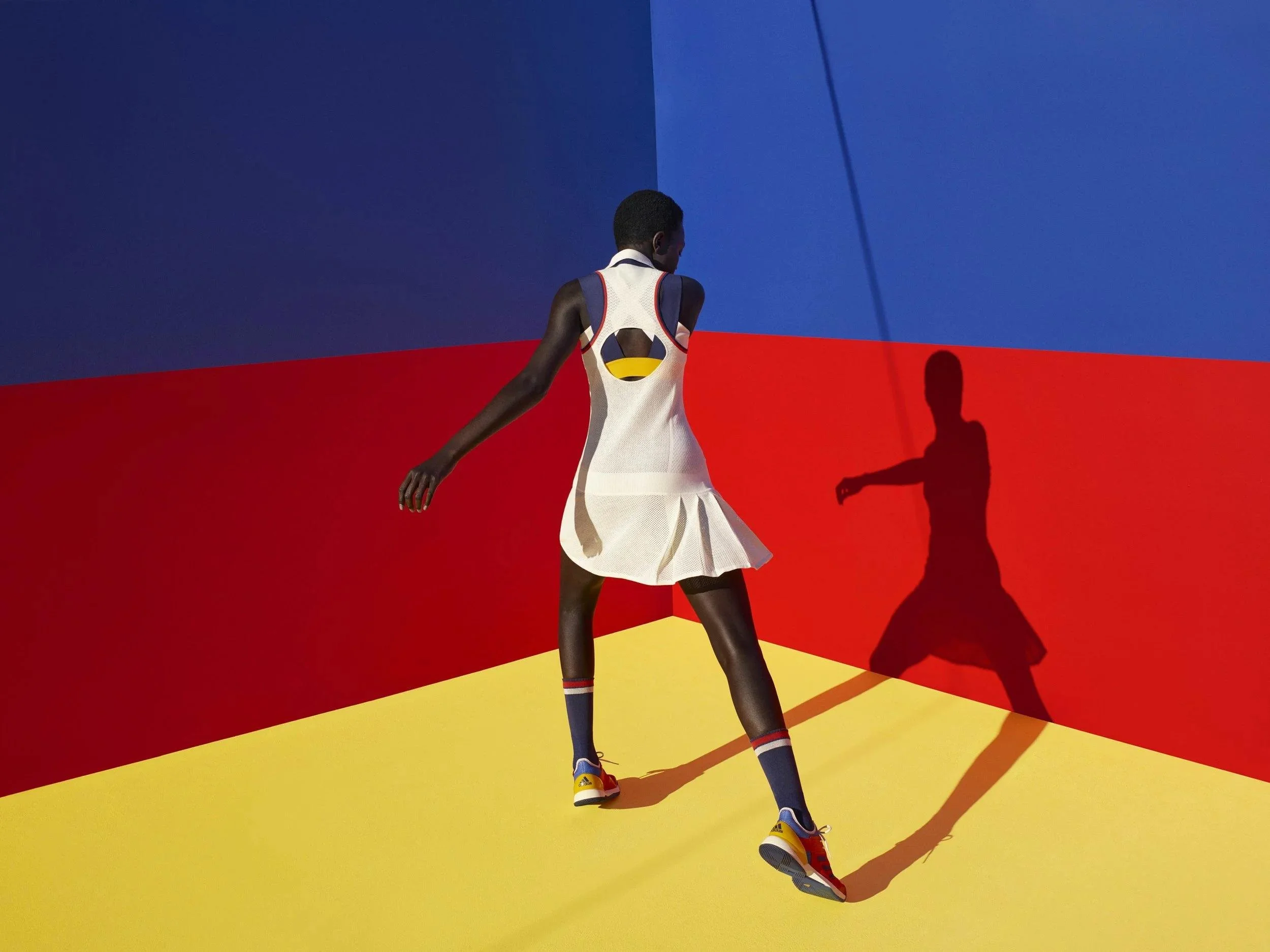
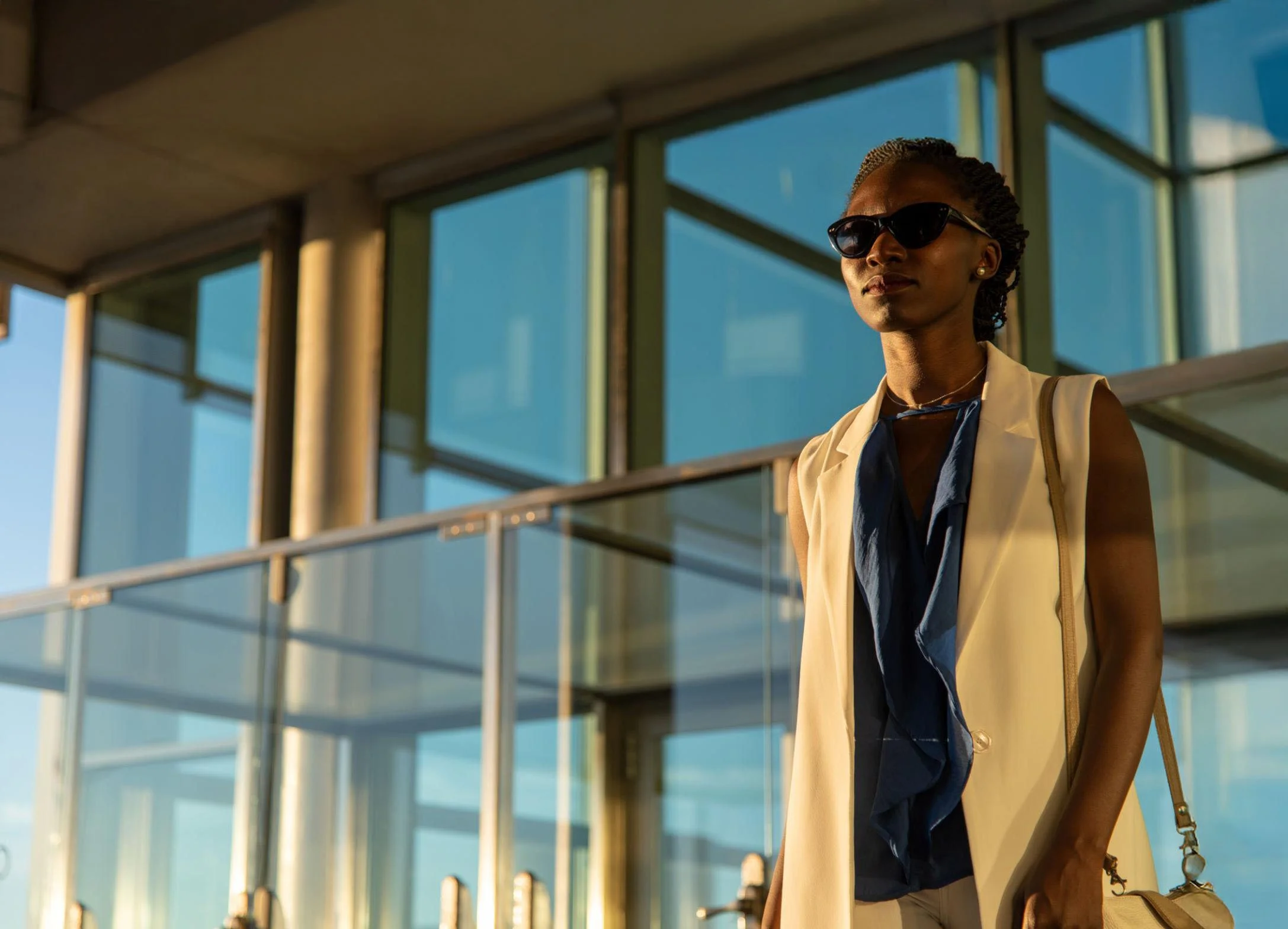
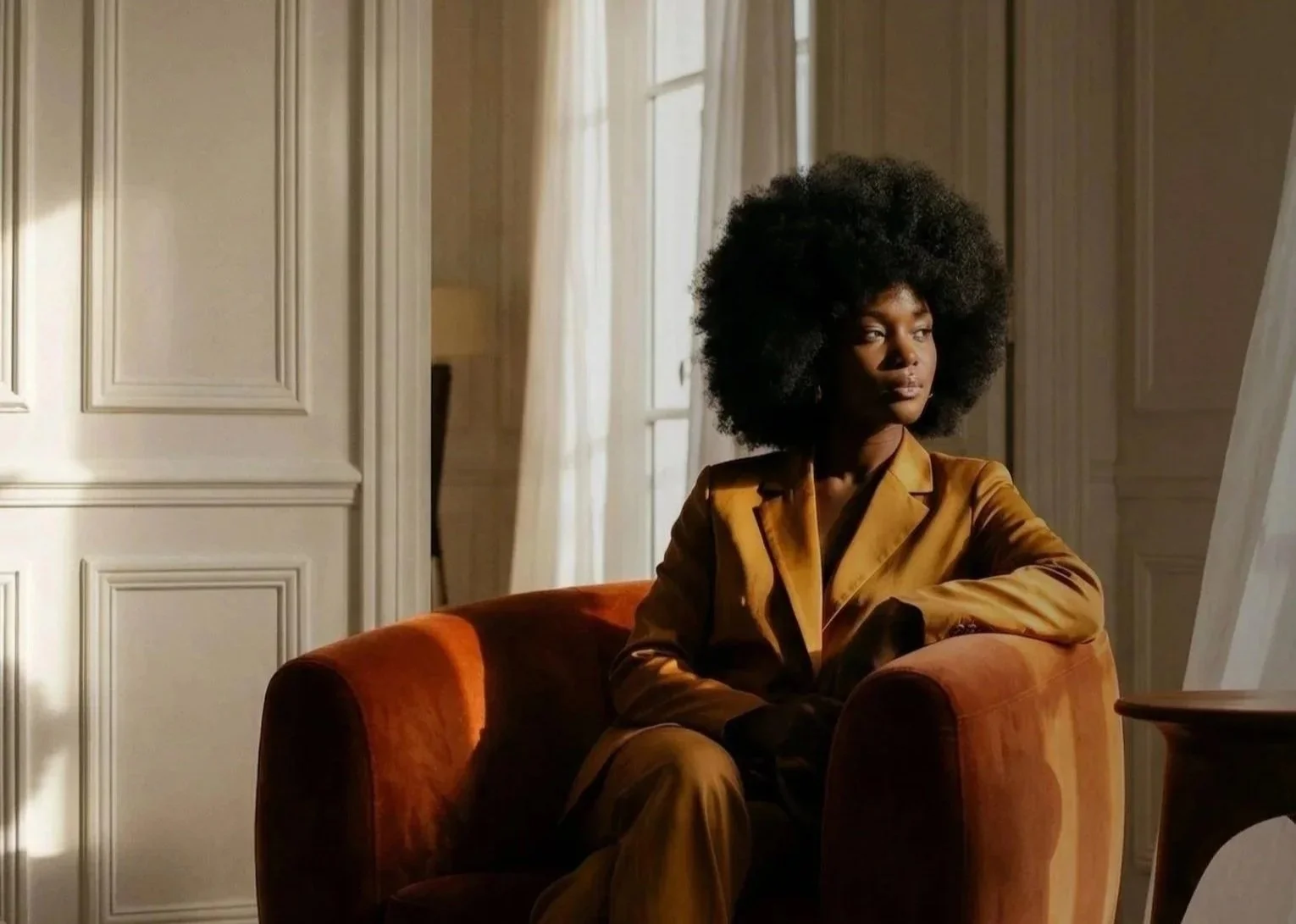
REFERENCES
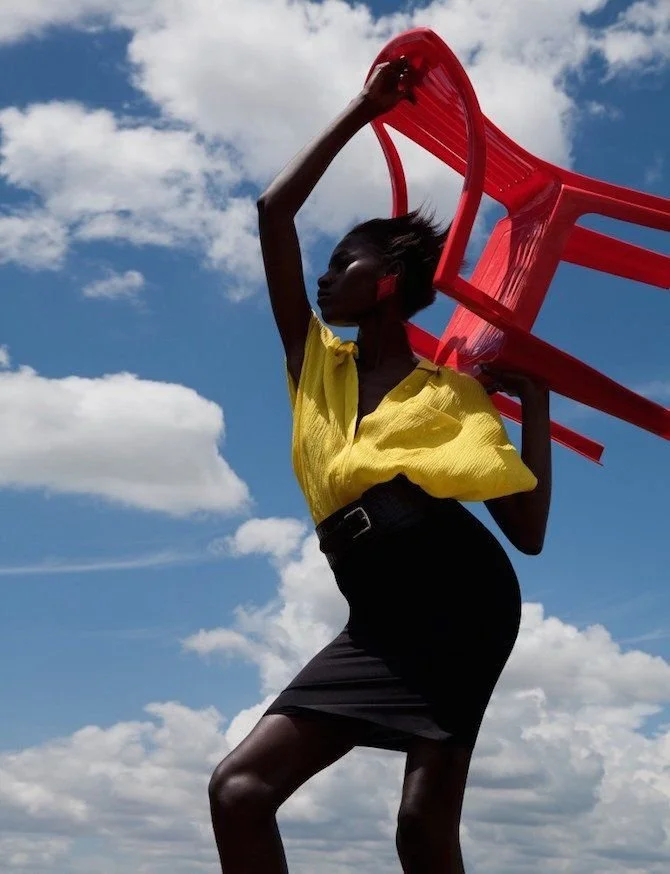
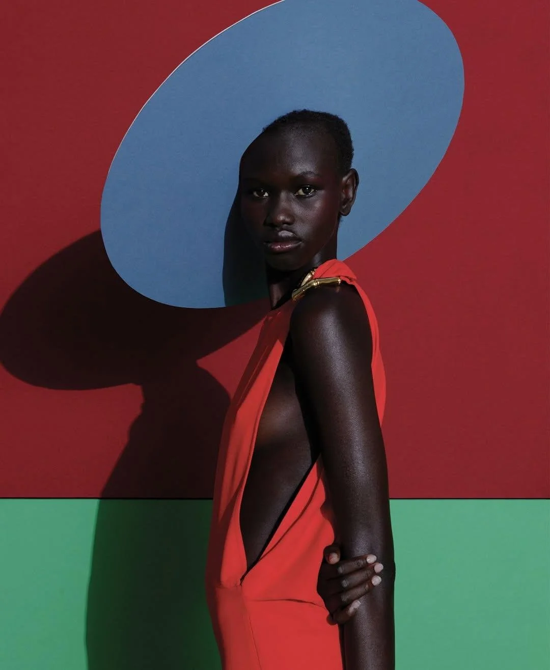
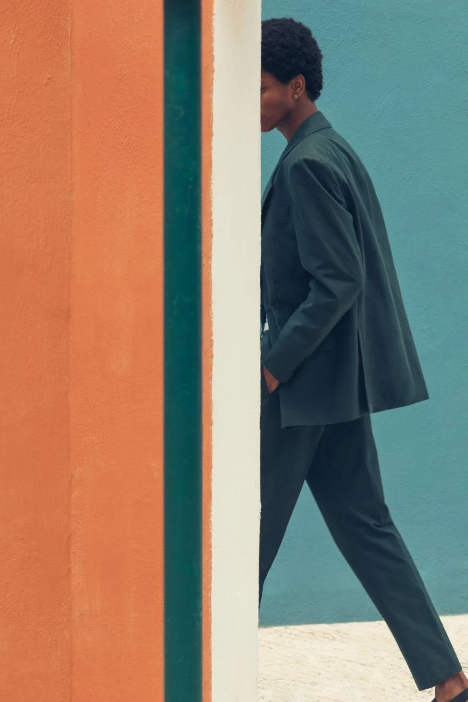
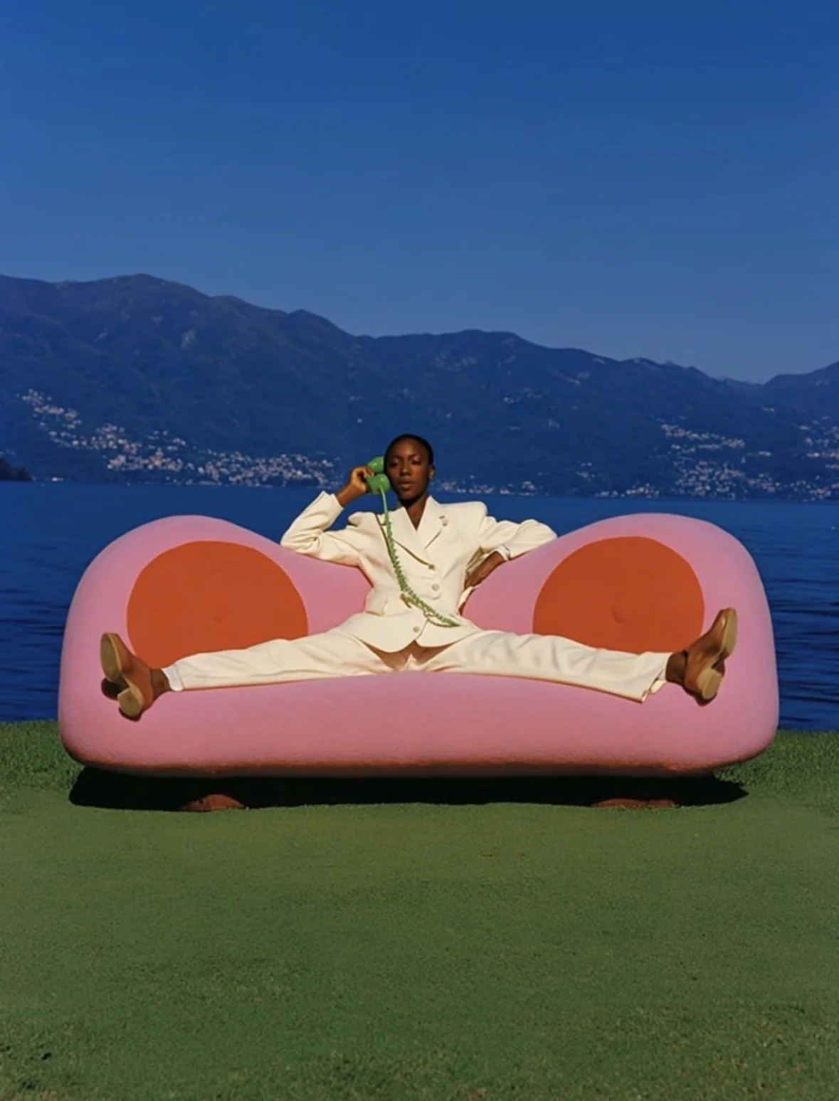
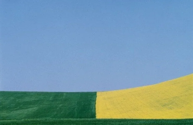
FRANCO FONTANA: Simplification and abstractization of form and color:
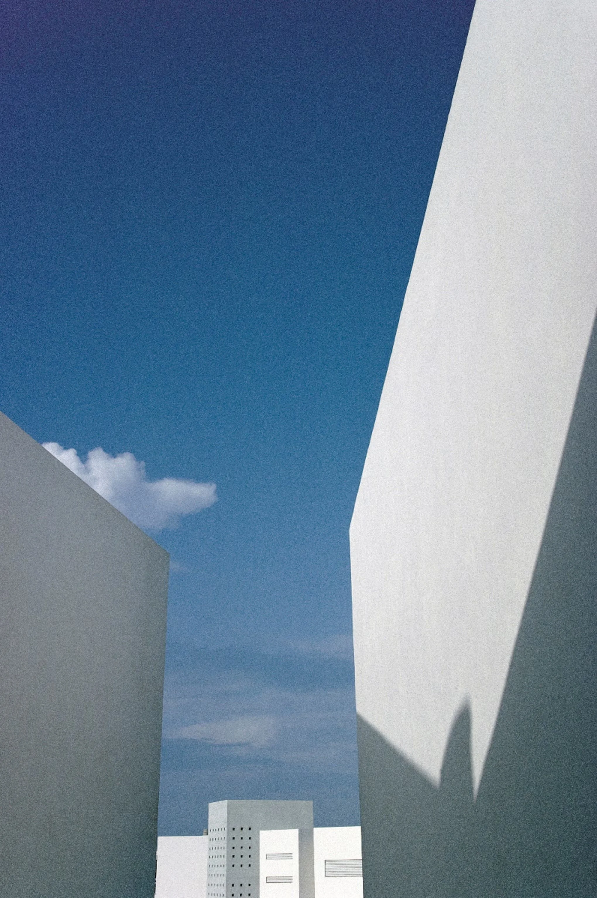
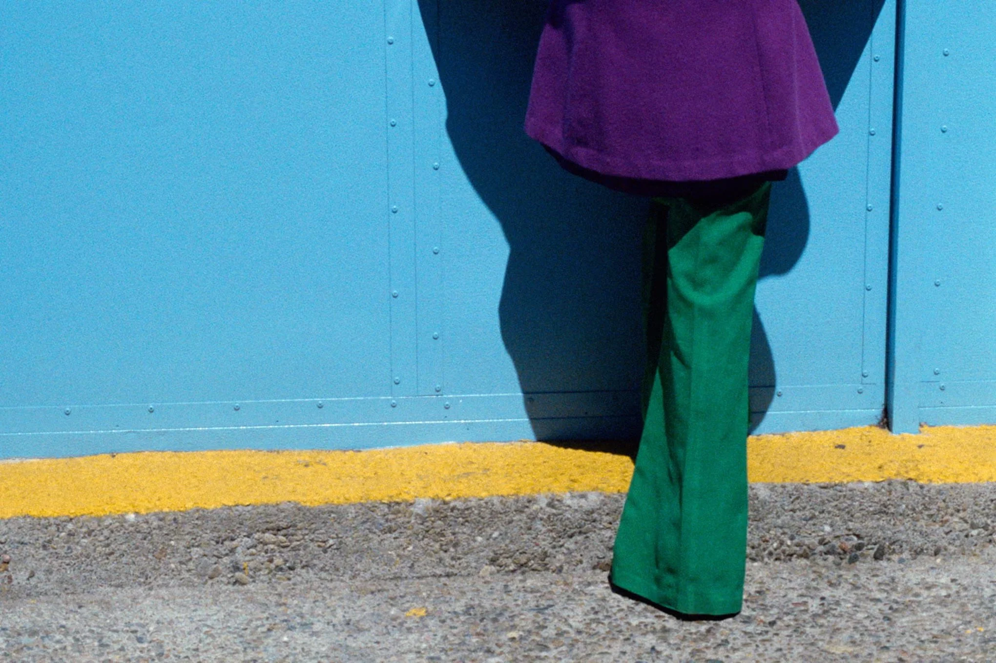
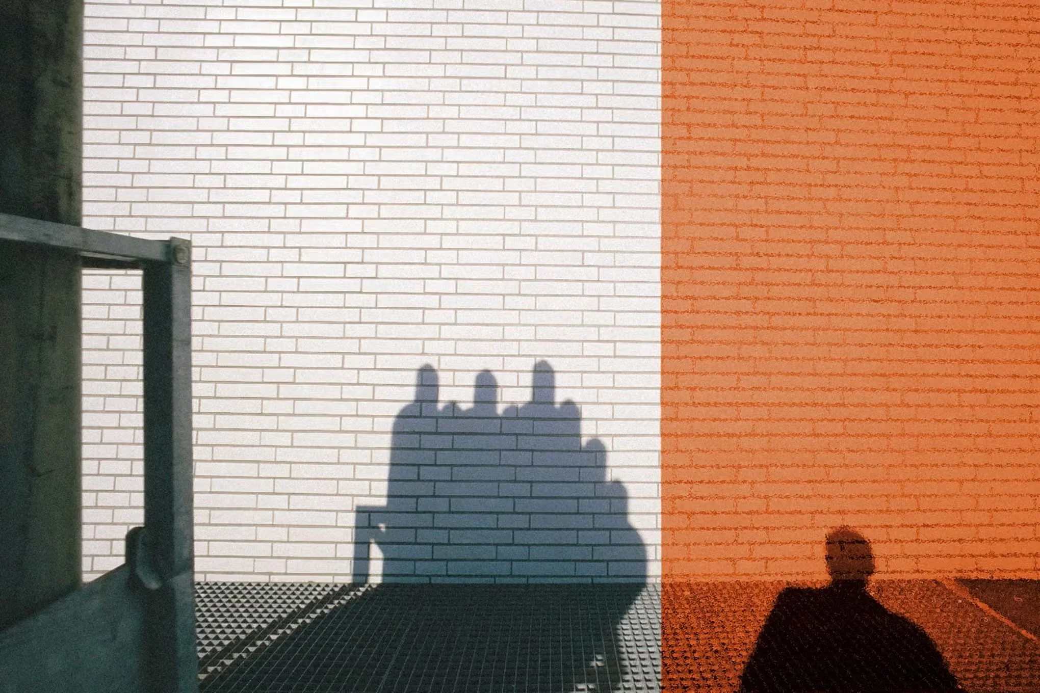
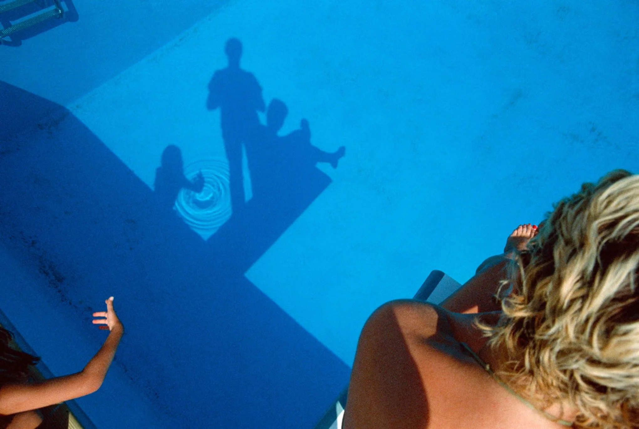
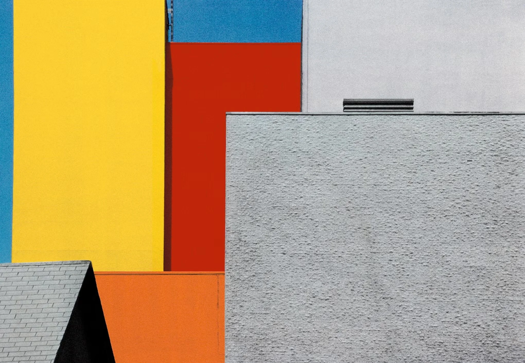
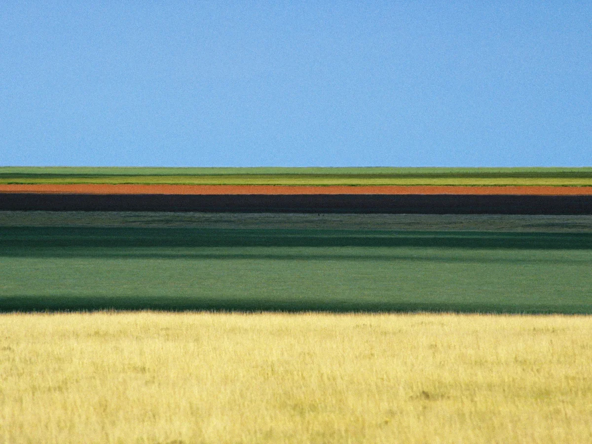
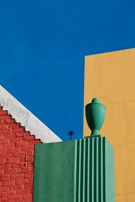
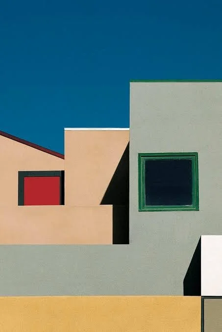
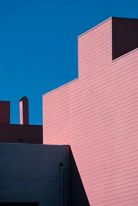
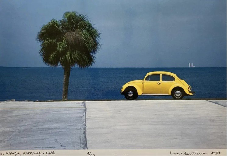
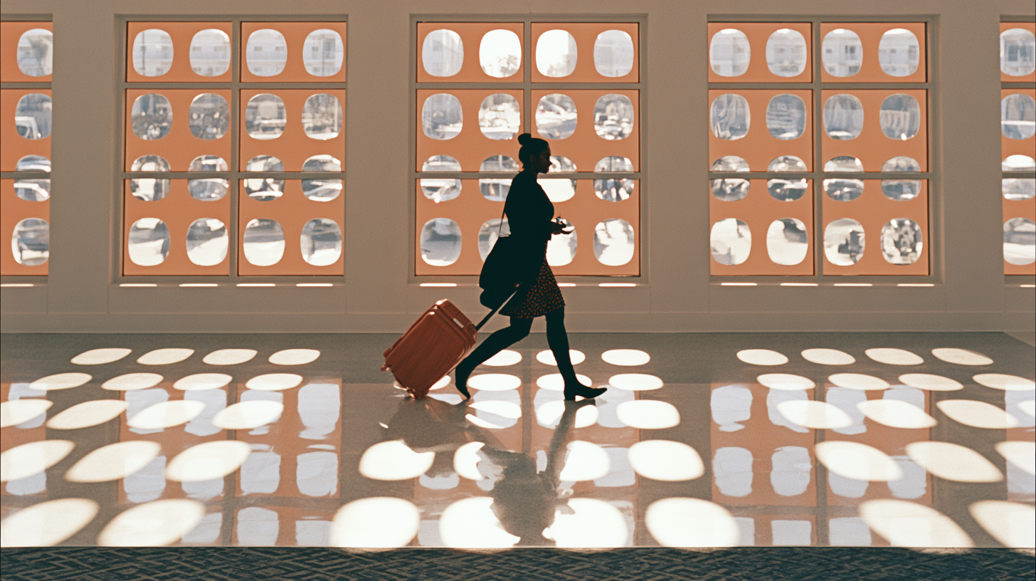
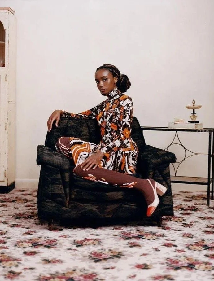
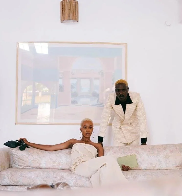
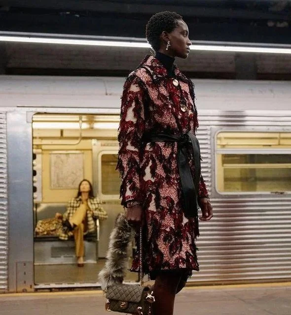
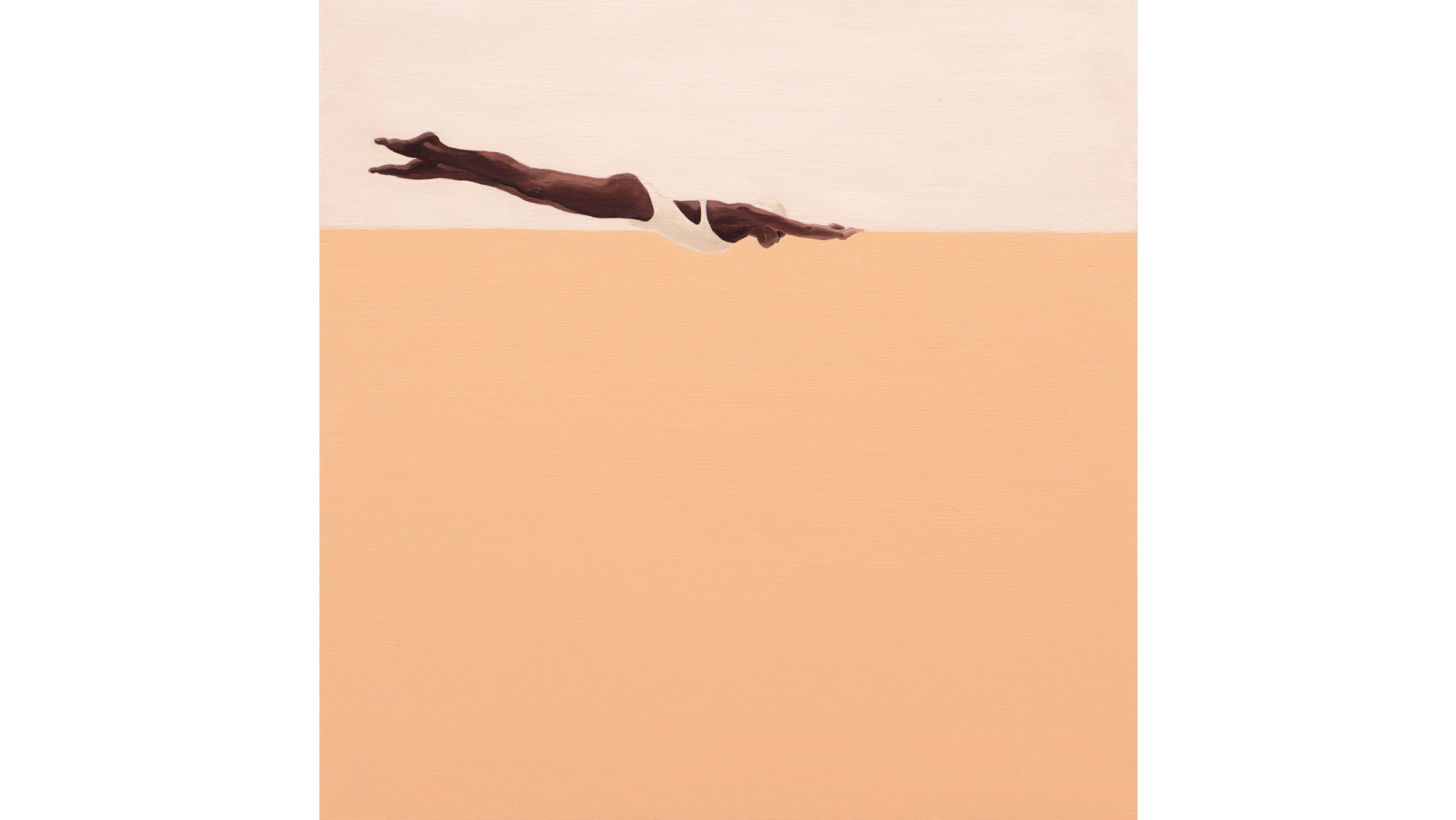
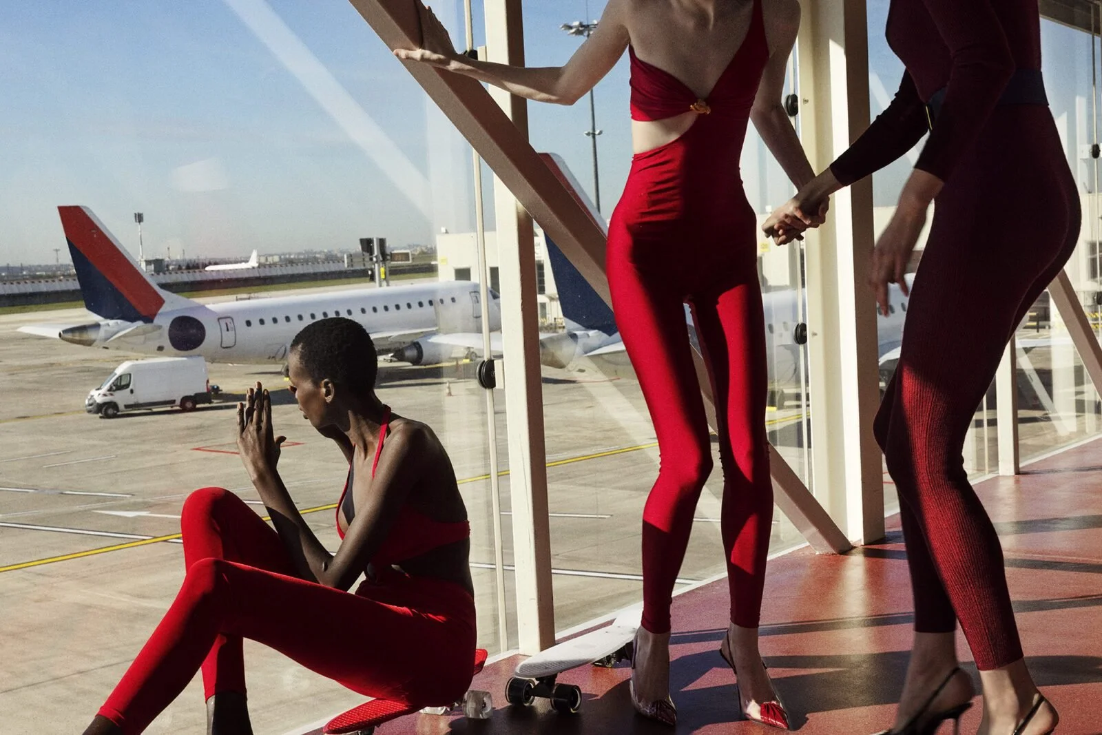
ANA PATITU: Flattening of perspective, graphic compositions, pastel tones. Also simplification of form
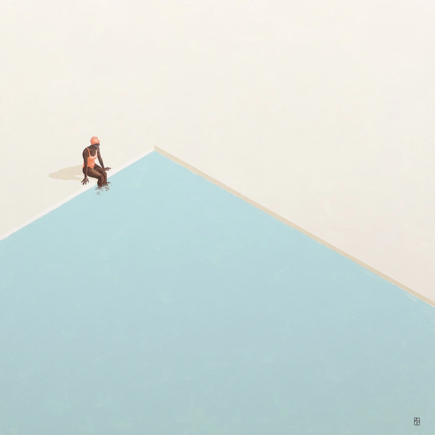

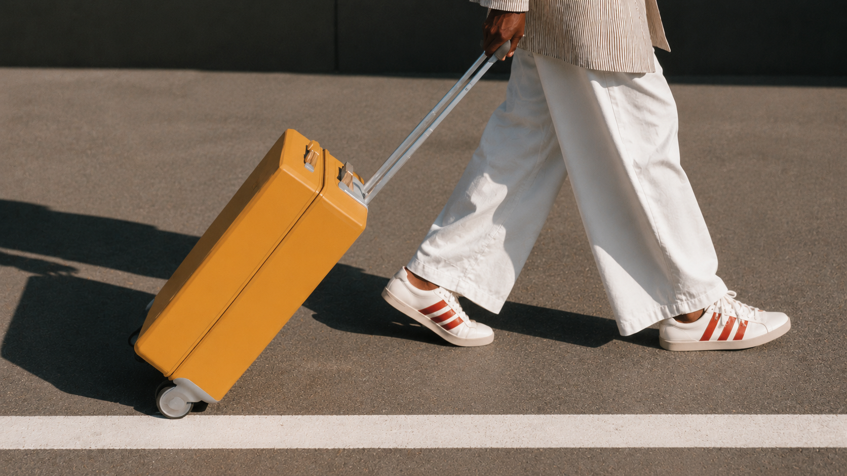
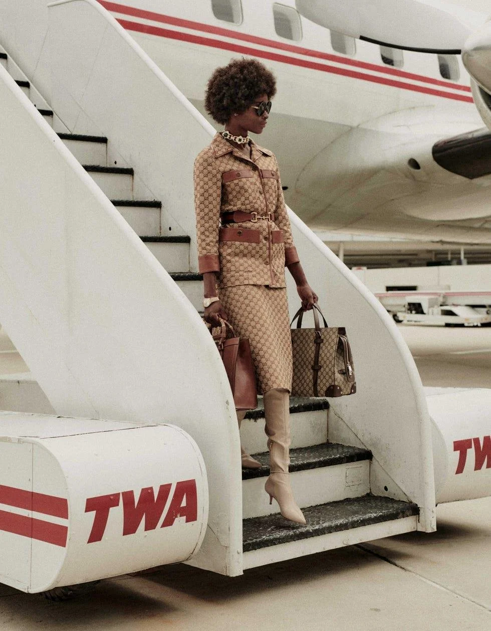
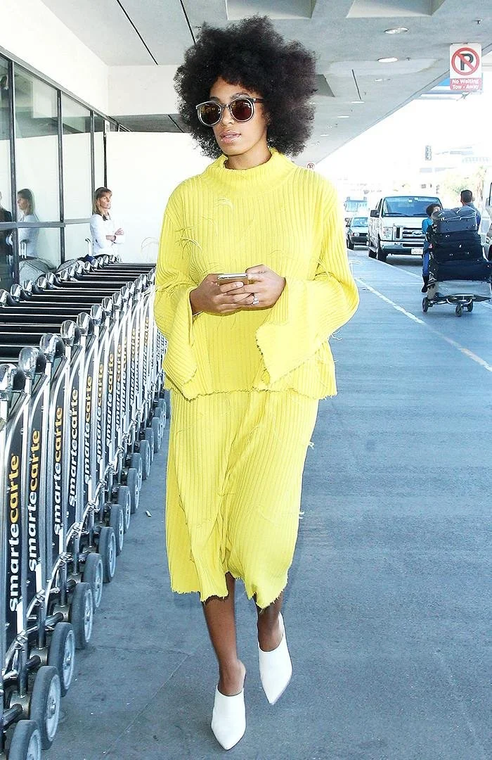
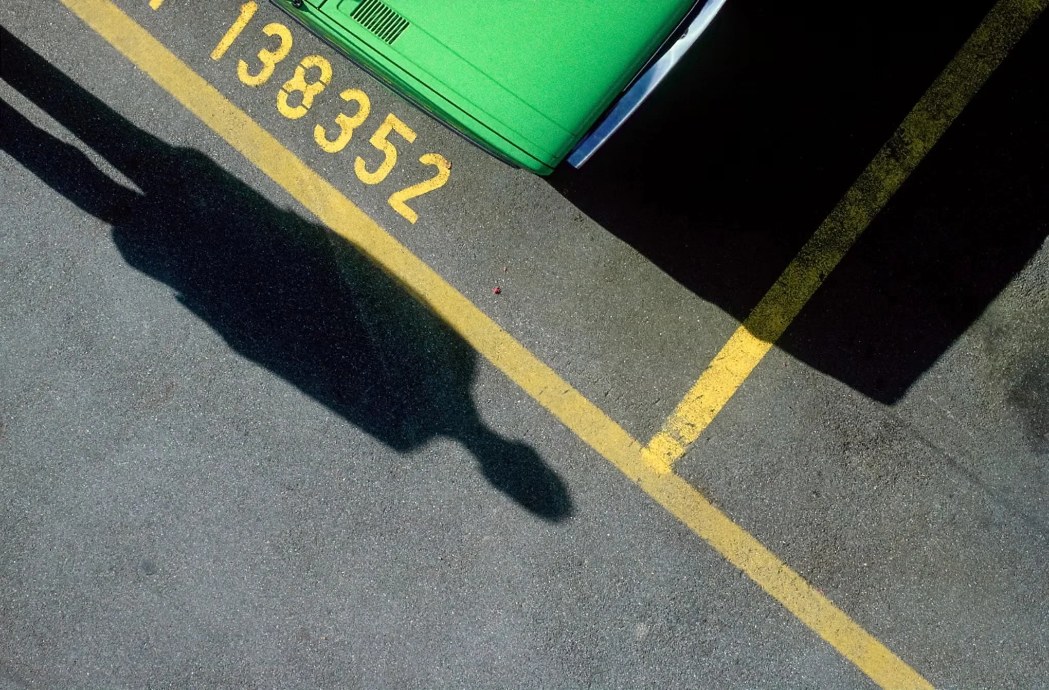
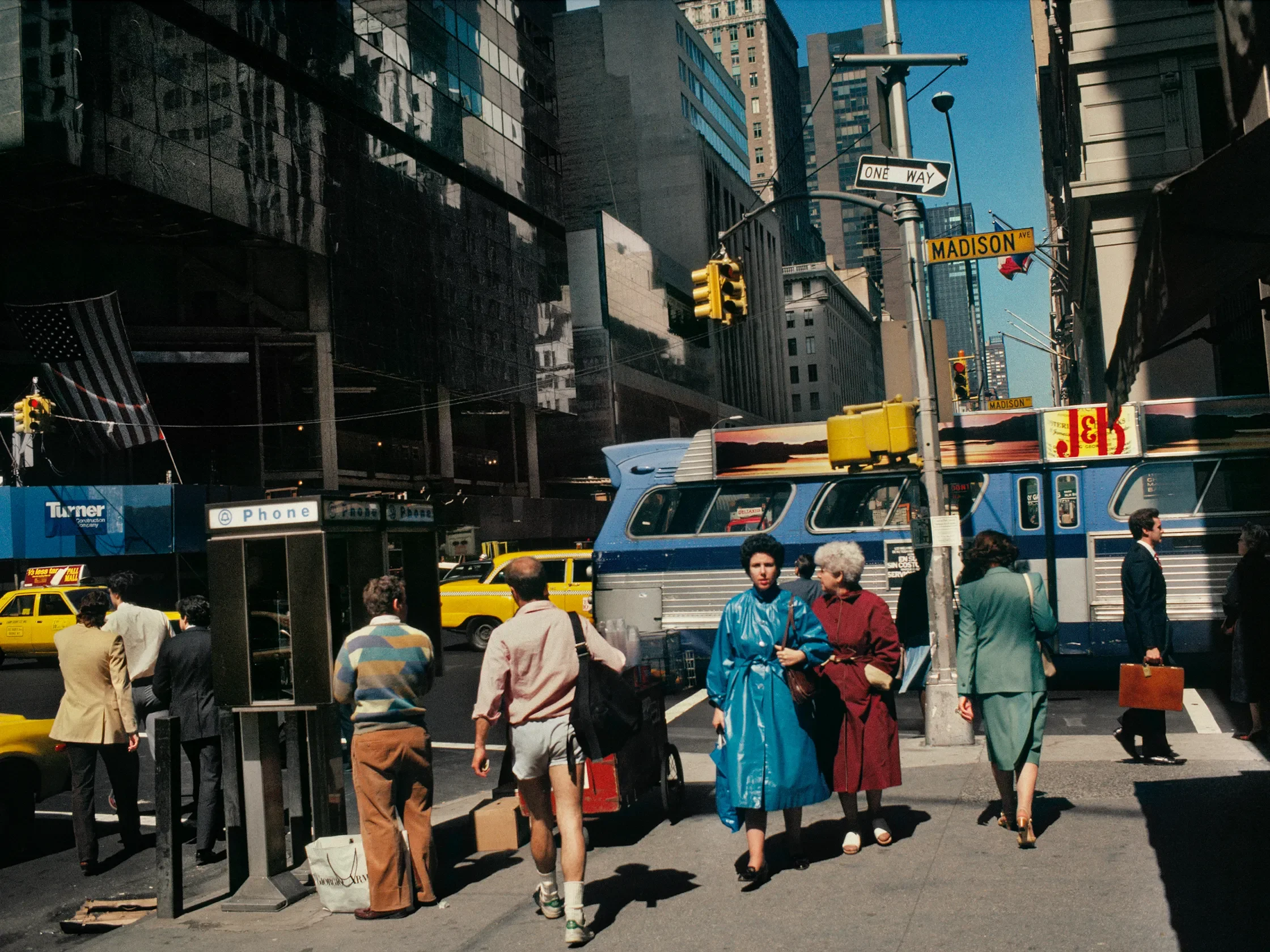
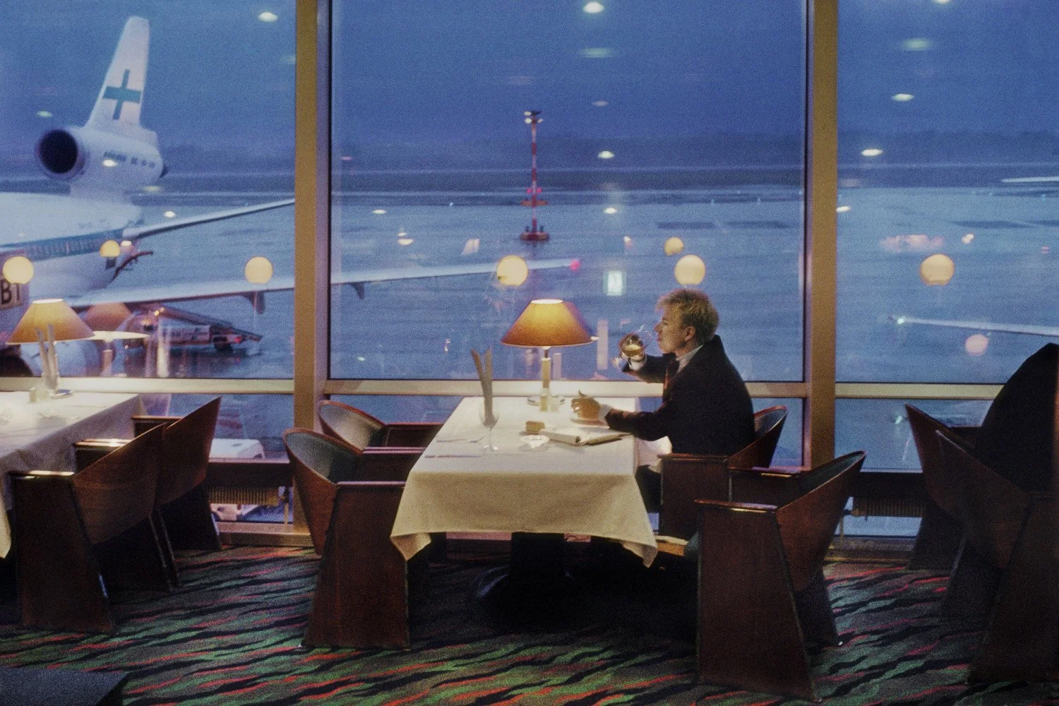
HARRY GRUYAERT: Color and sunlight / frontlight:
He has a book of photographs set in an airport - link here
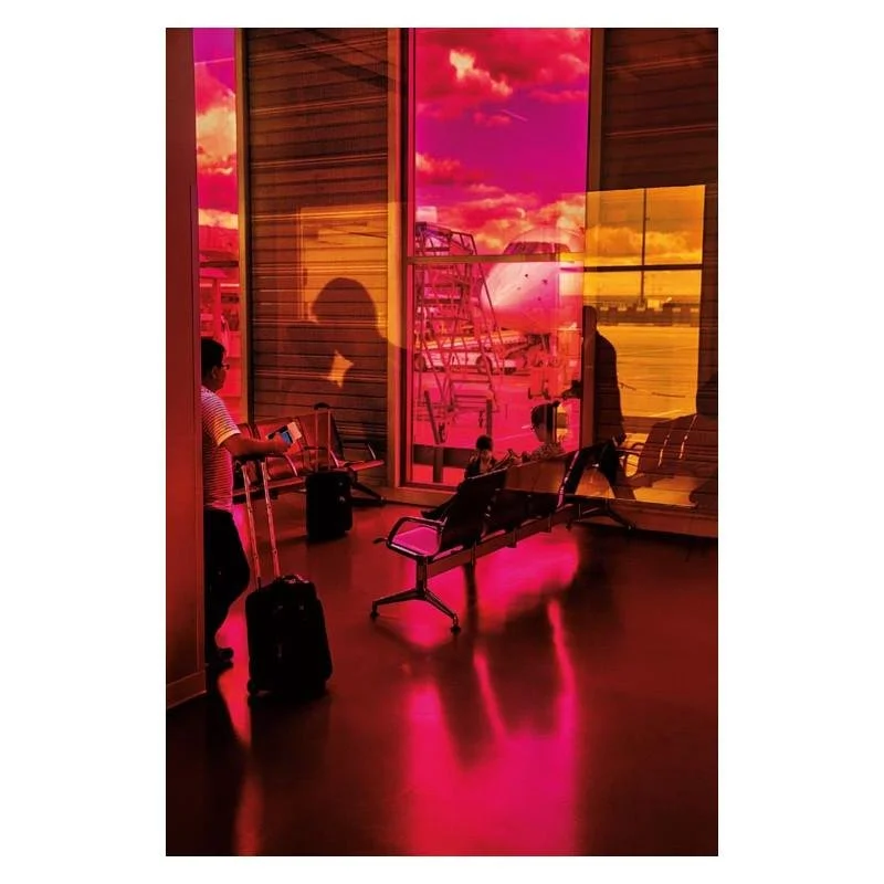
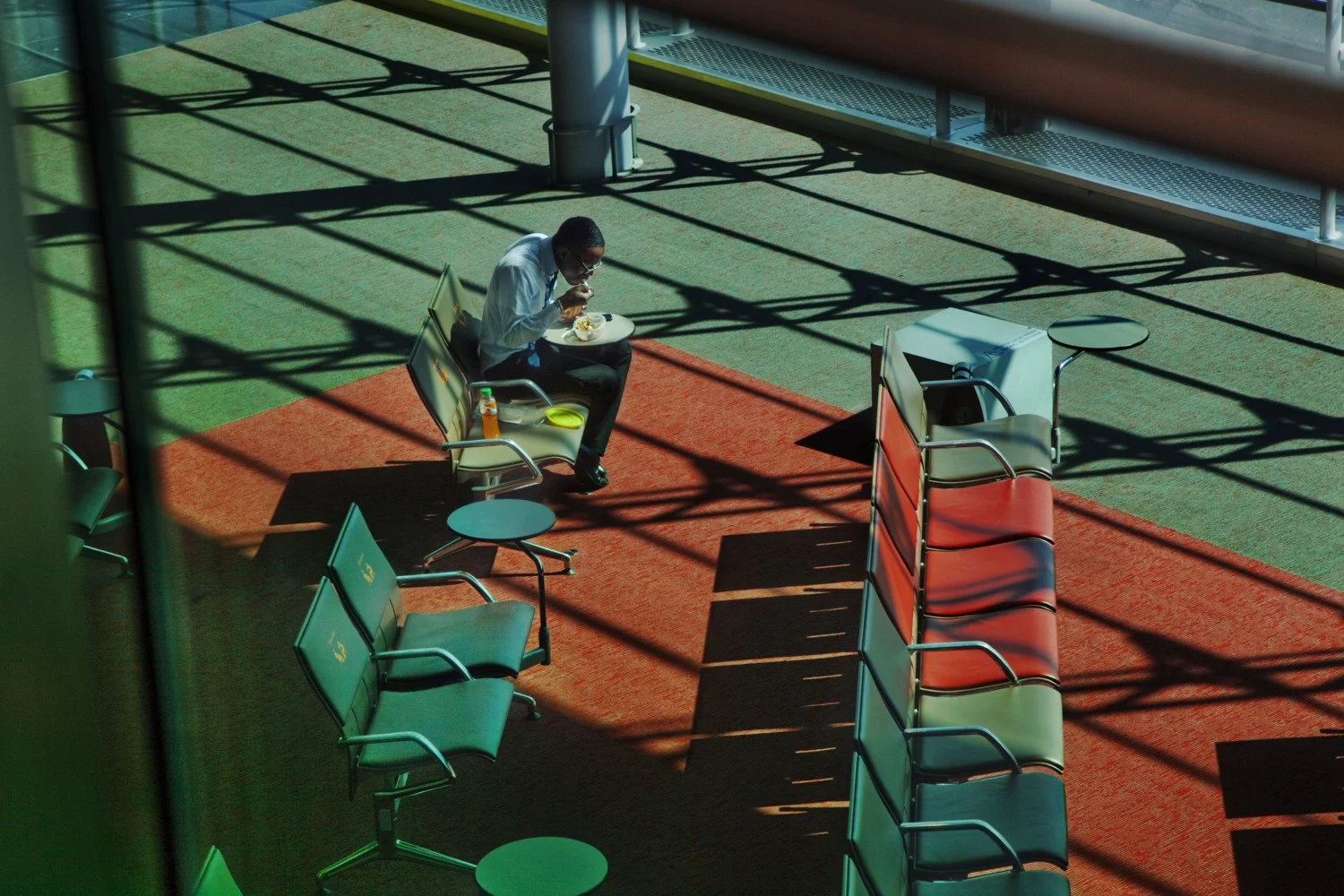
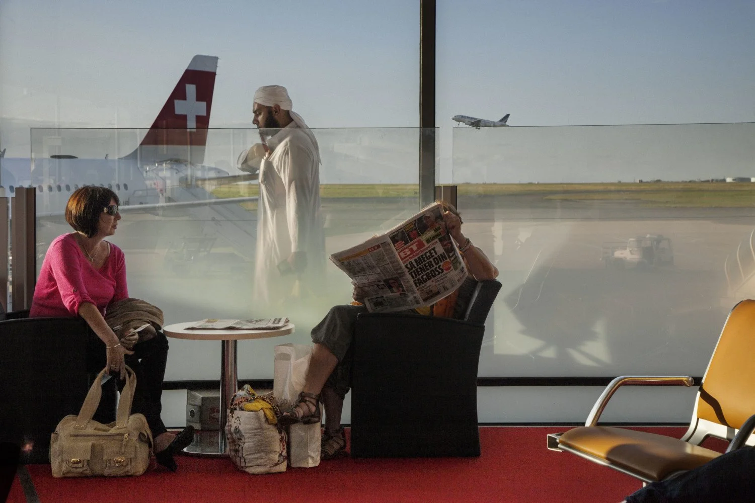
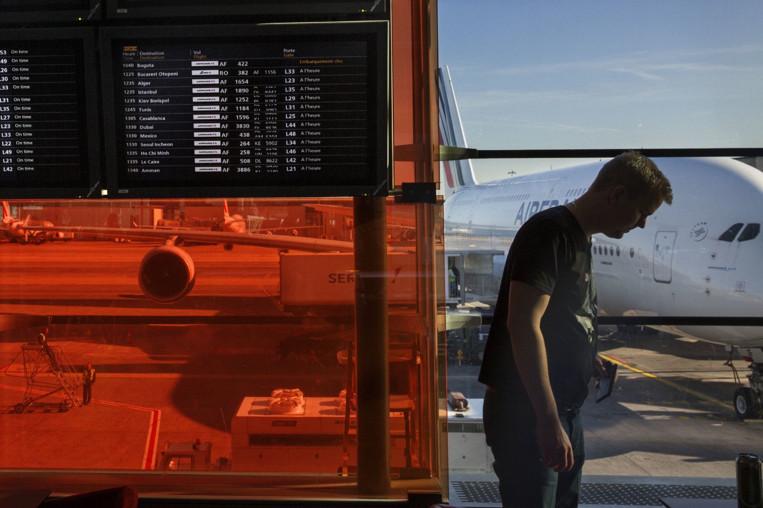
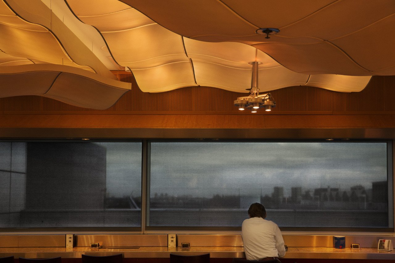
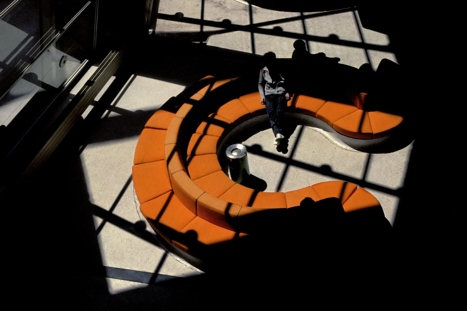
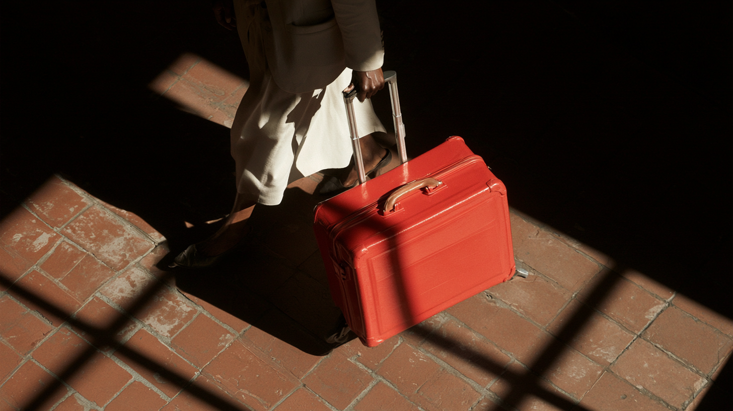
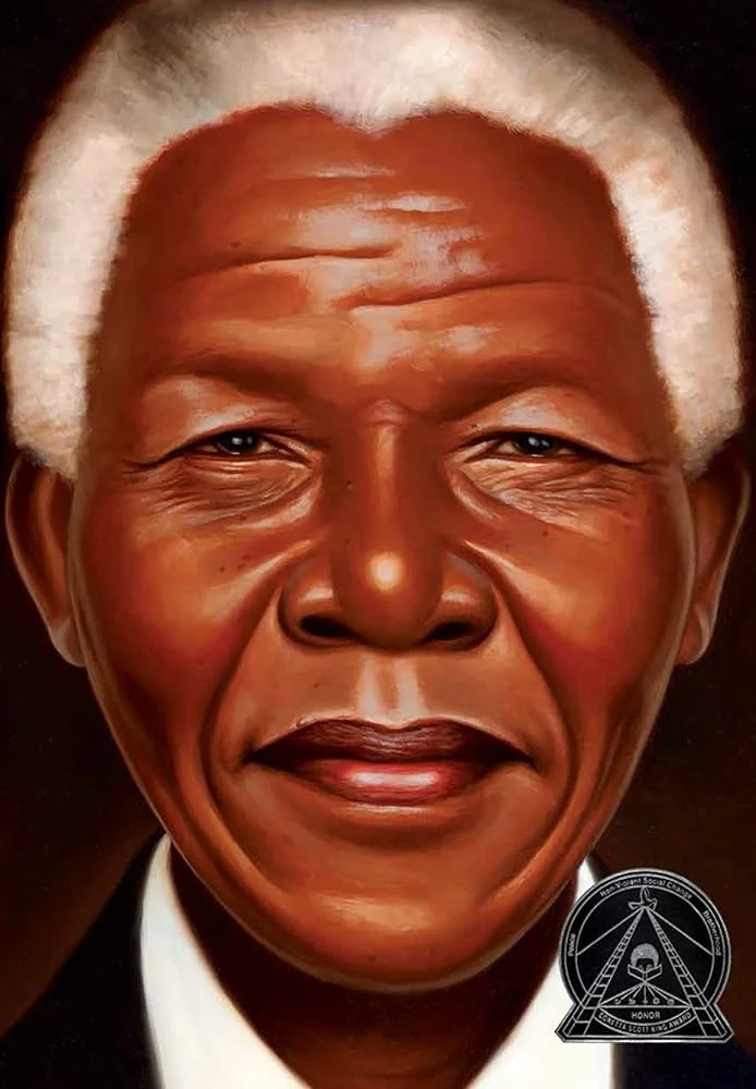
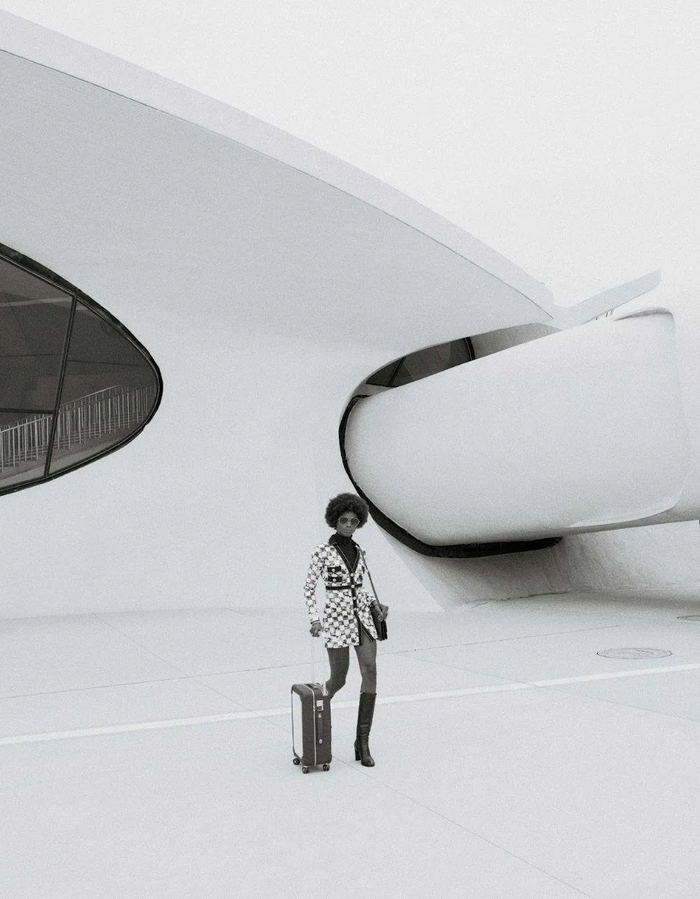
PAUL D’AMATO: Sunlight creating stark contrast
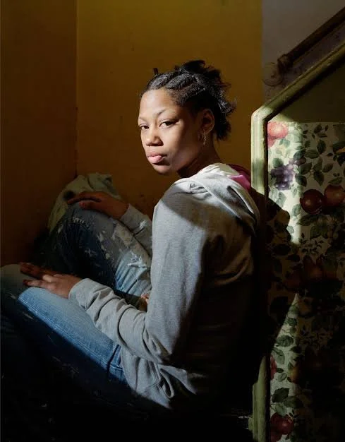
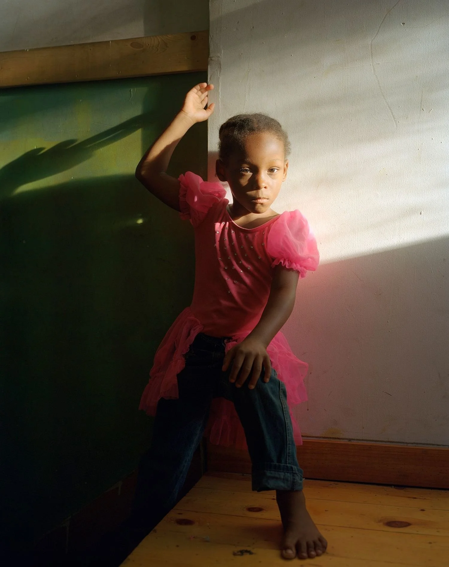
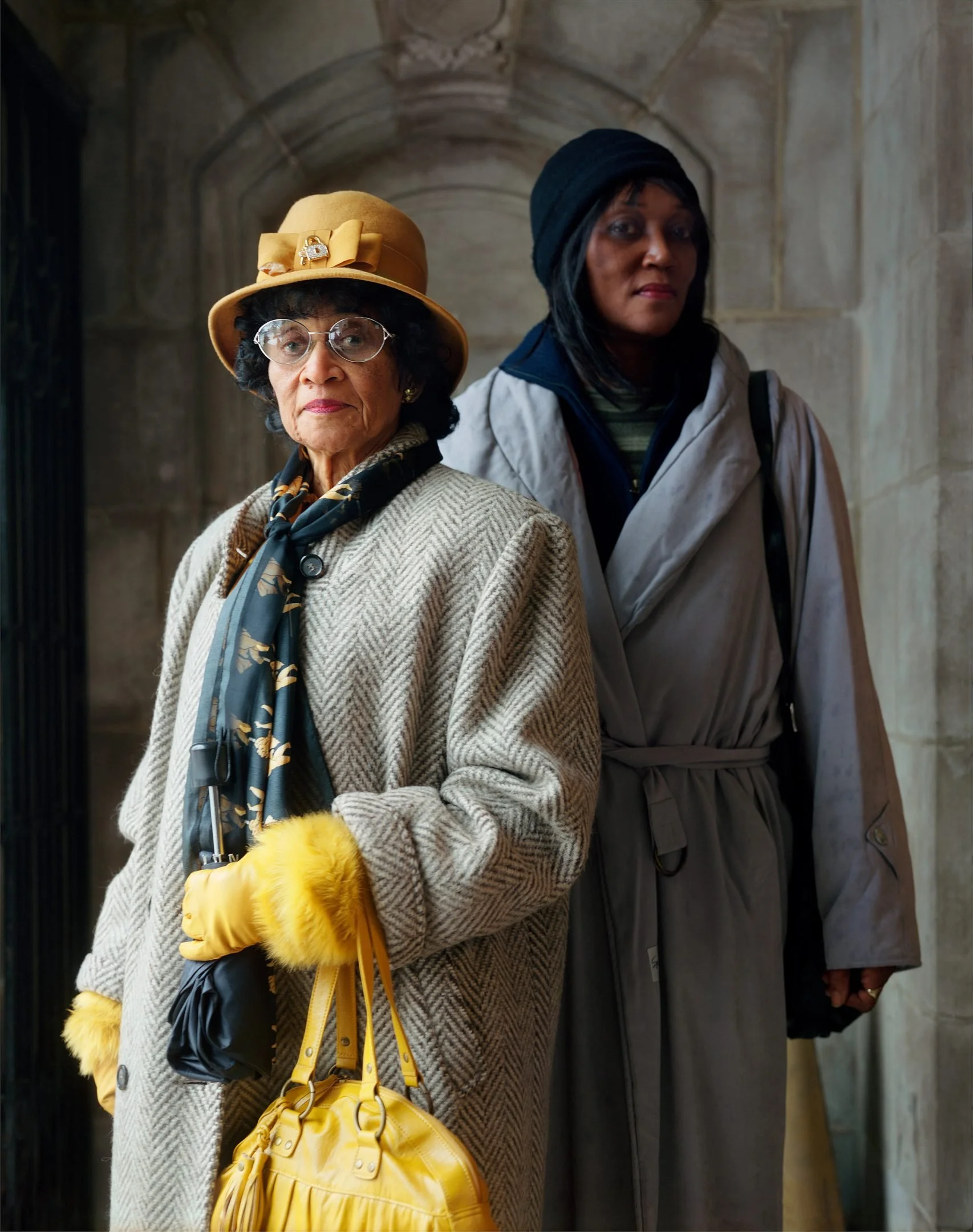
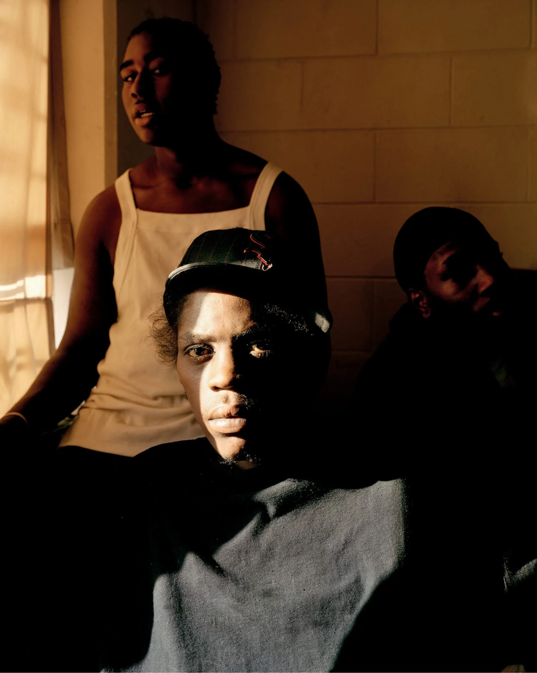
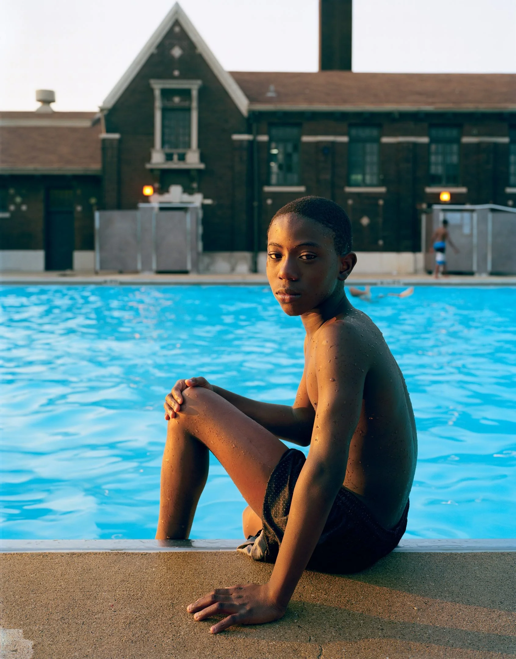

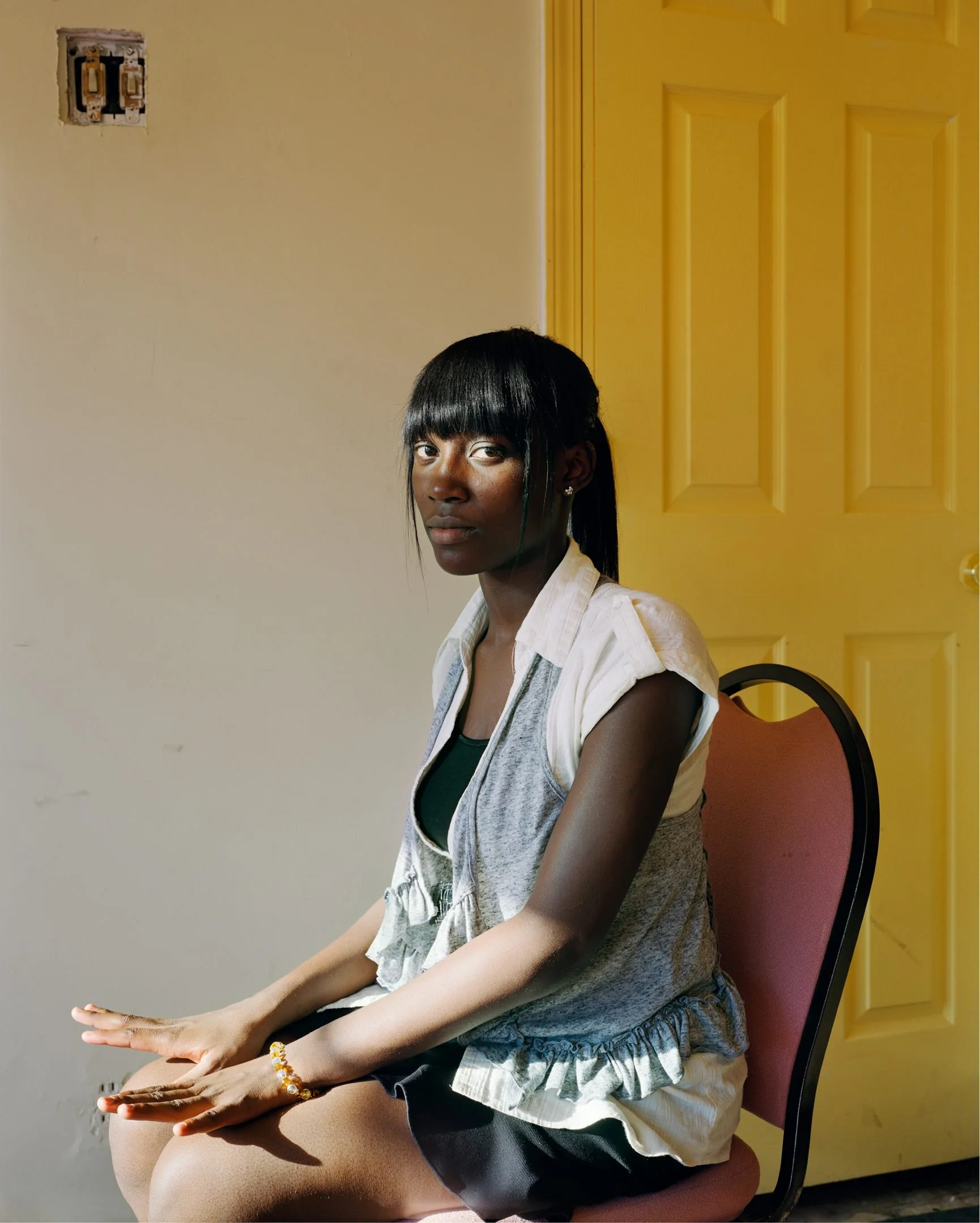
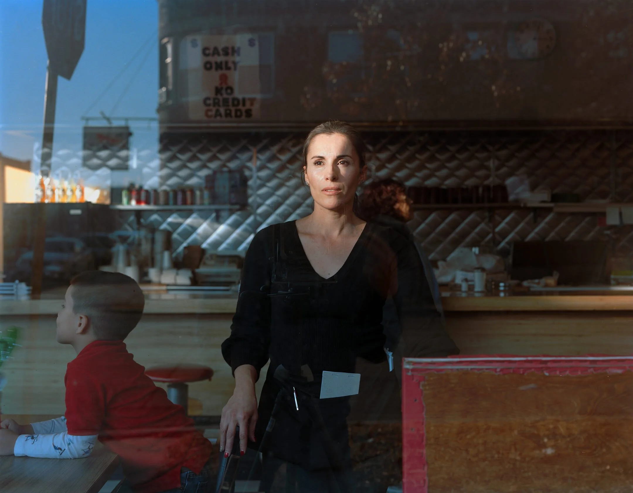
HOW CONTROLLING THE BACKGROUNDS CHANGES THE FEELING OF A SHOT:
keeping the foreground identical, with direct sunlight, but changing the design of the enviorment can make a shot feel soothing, hectic, etc
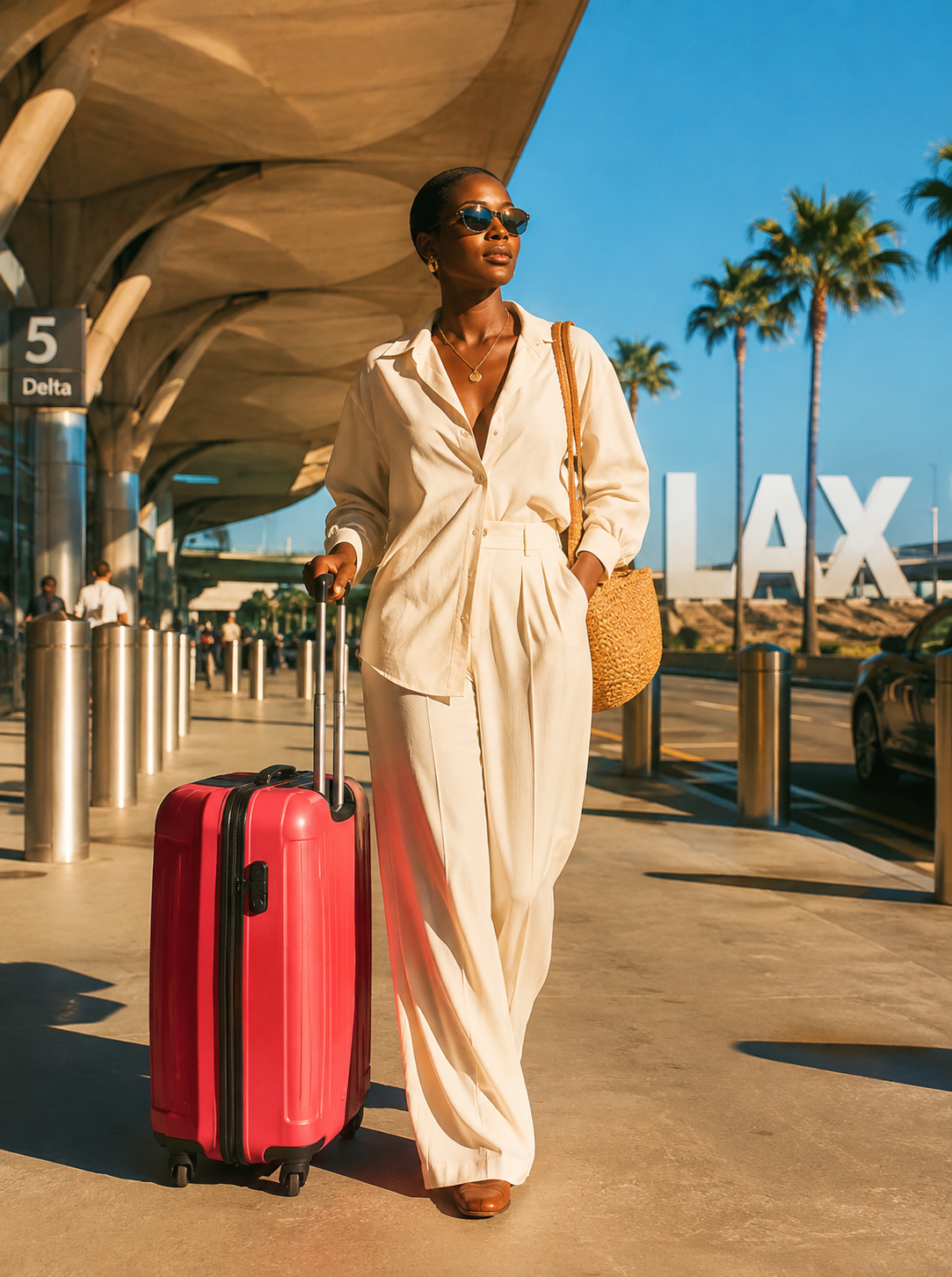
OUTSIDE
Direct sunlight, medium texture and varied colors in background make us read foreground and background equally
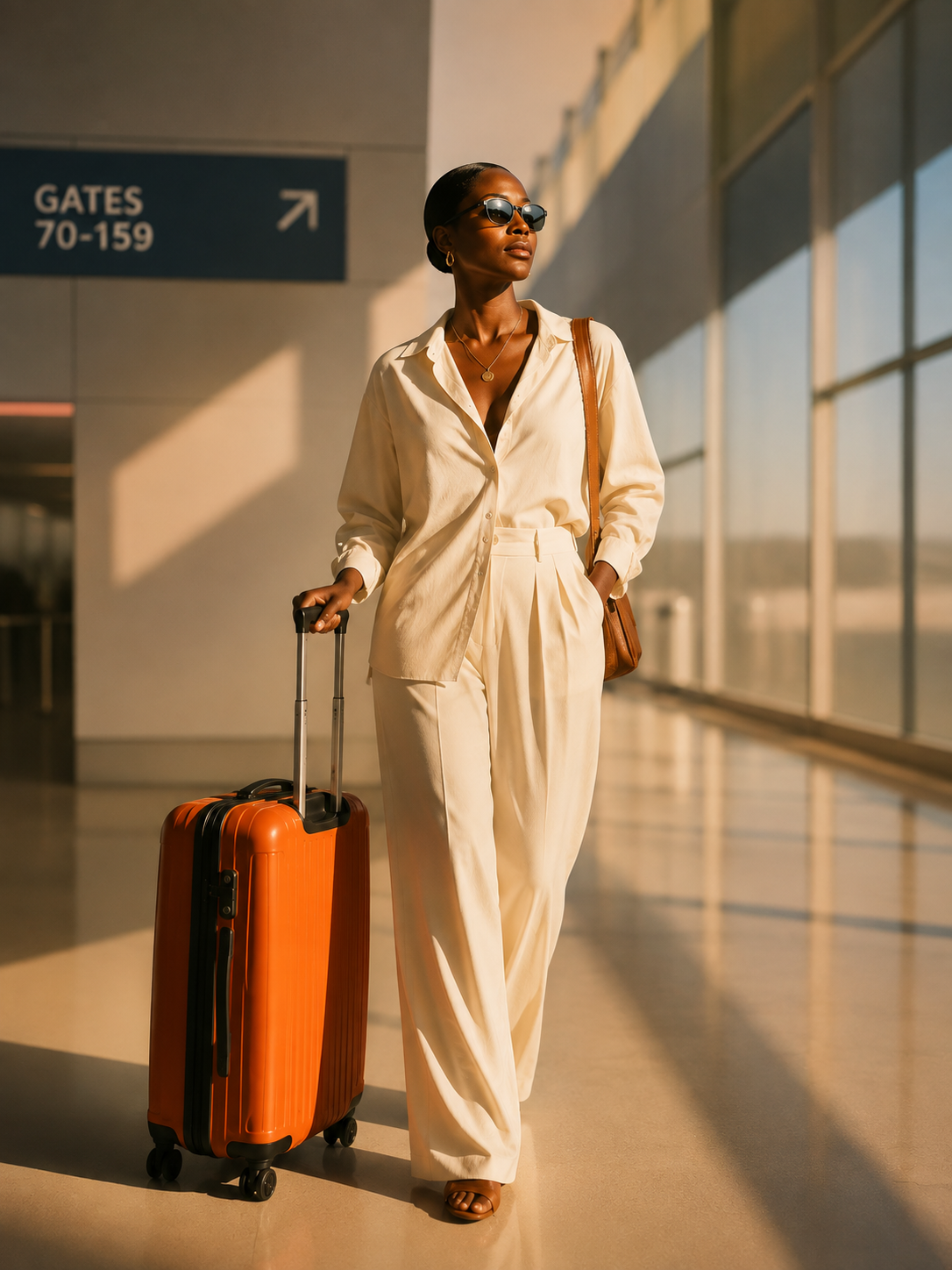
INSIDE SIMPLE
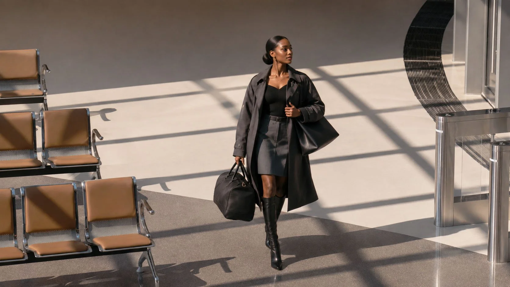
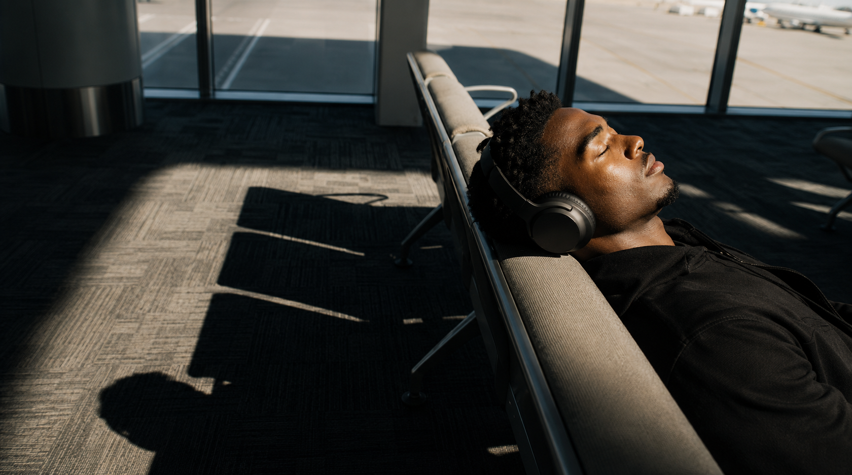
Direct sunlight (windows), simple background with little texture and limited color palette makes us focus more on the foreground
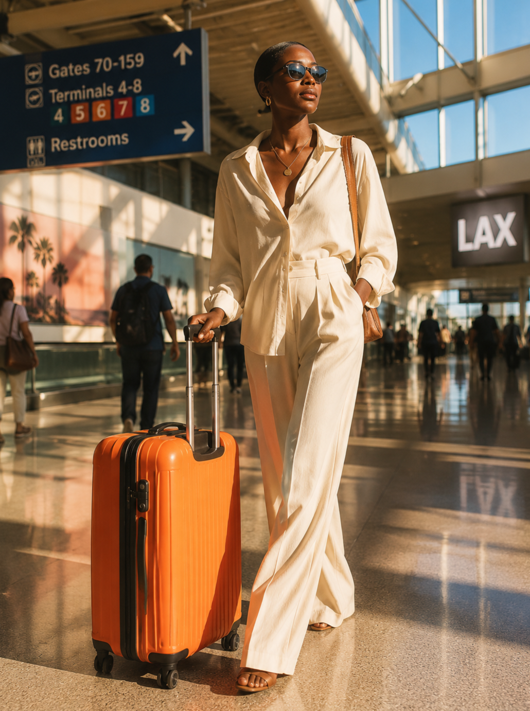
INSIDE MESSY
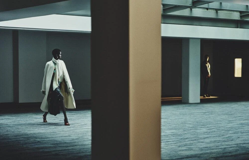
More realistic, but messier because there are lots of opposing textures and colors in the background, which makes it harder to focus on foreground
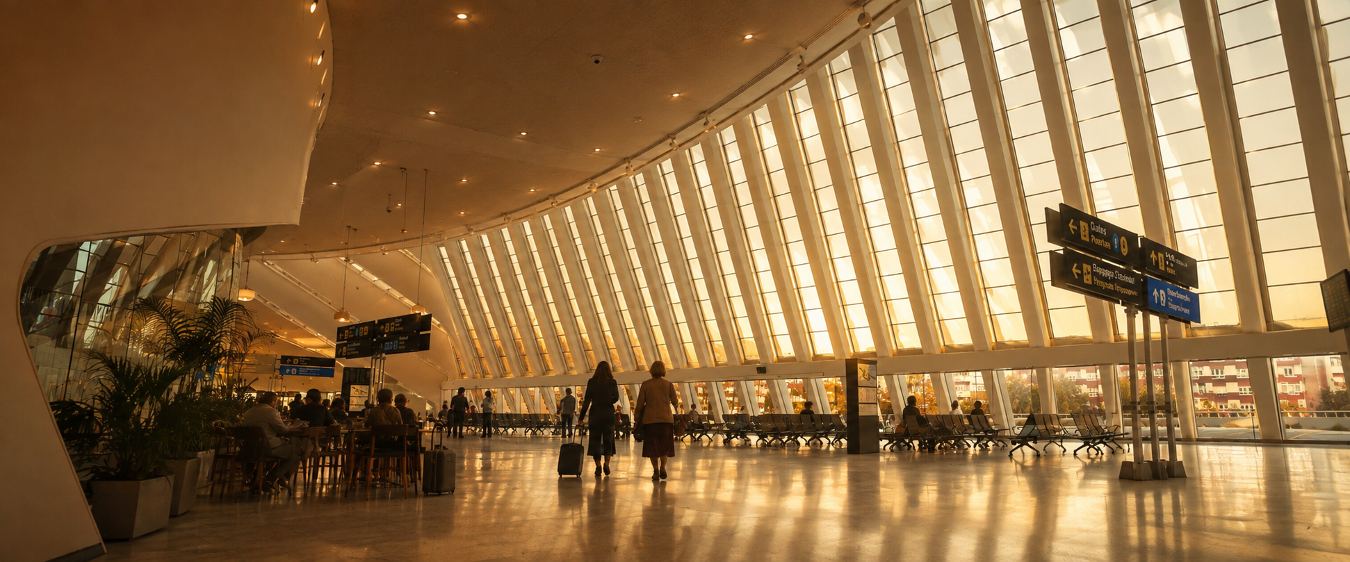
SCHEDULE AROUND USING REAL SUNLIGHT FOR WIDE SHOTS AND TRANSITIONS:
TIGHTER SHOTS CAN BE LIT WITH ARTIFICIAL SUNLIGHT:
ARCHITECTURE / LOCATIONS
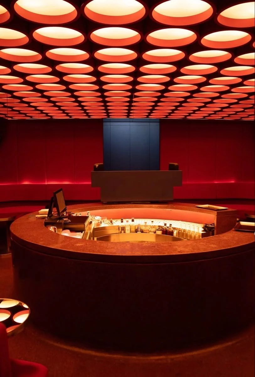
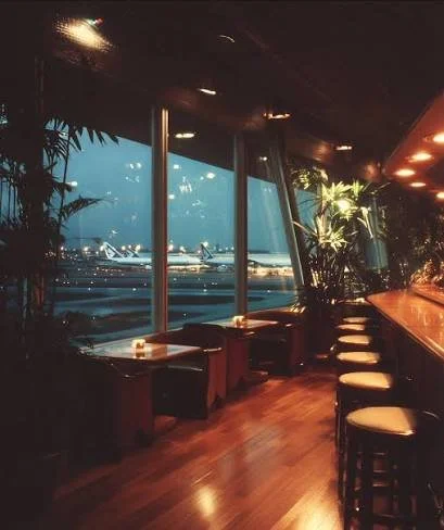
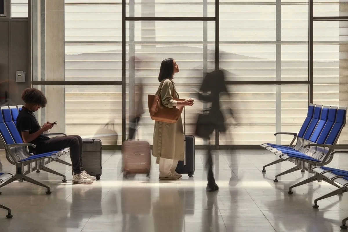
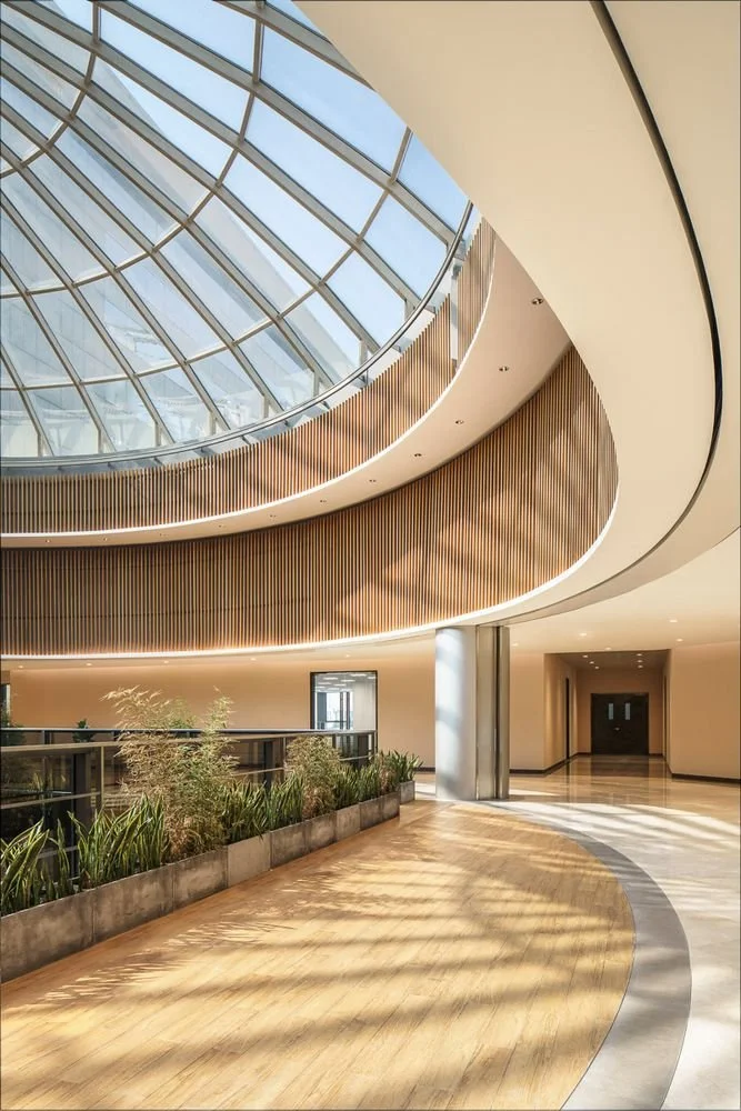
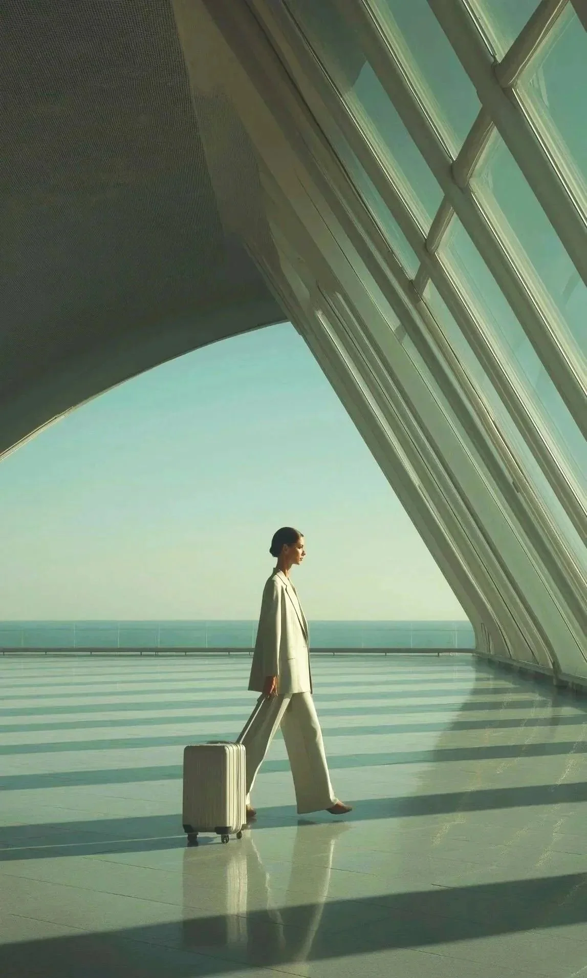
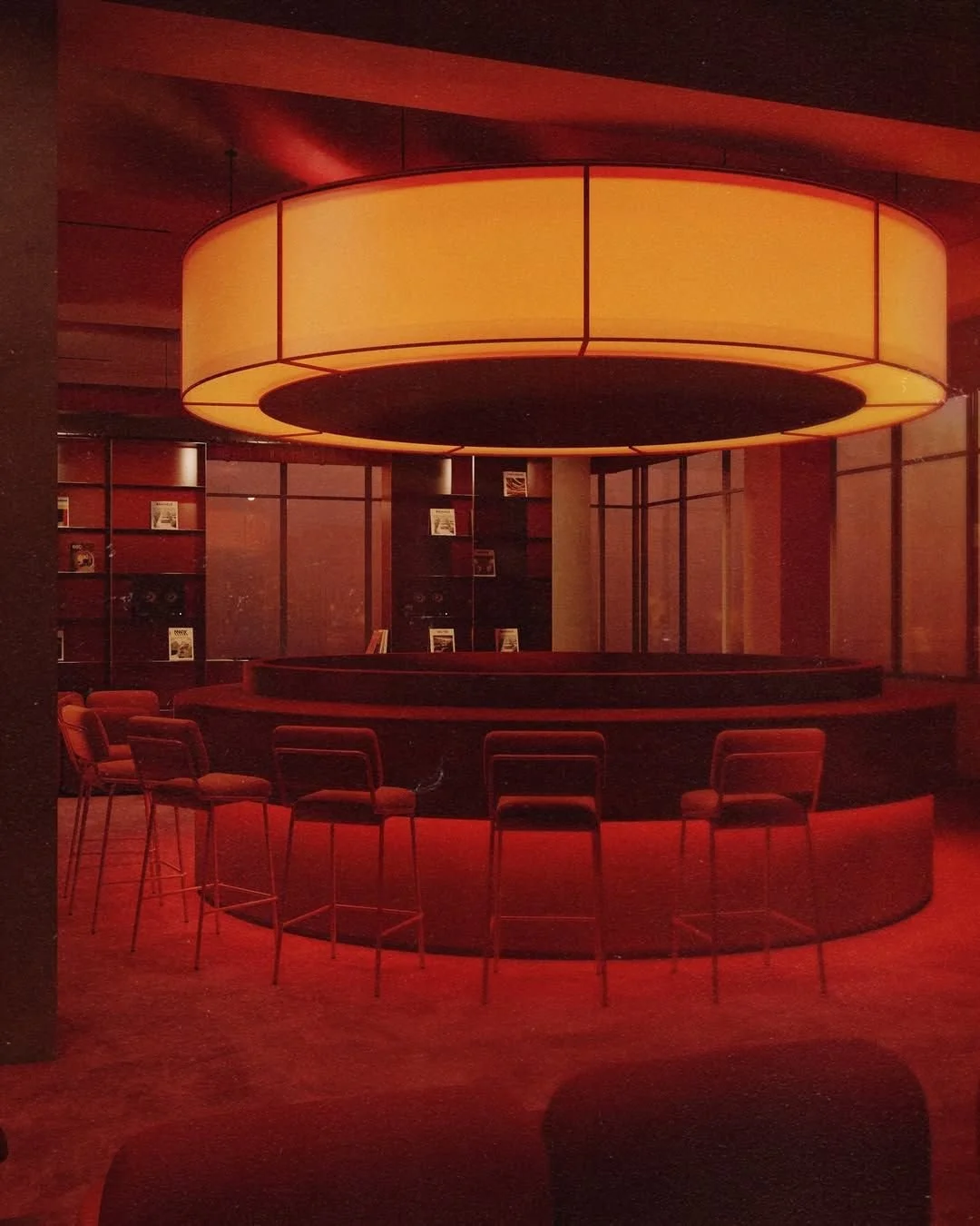
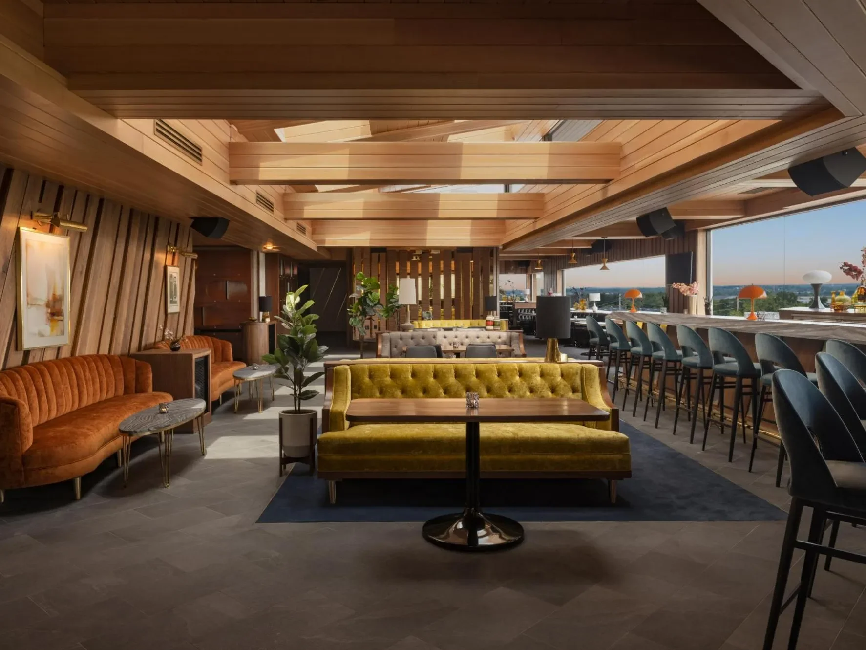
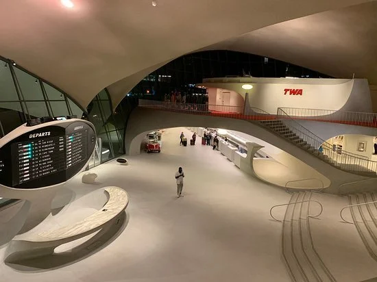
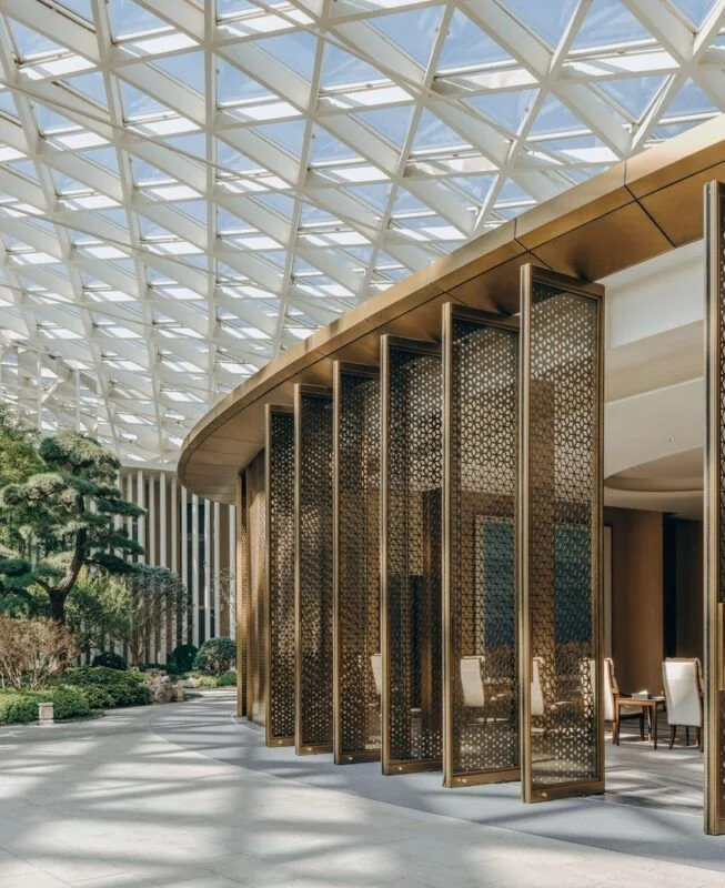
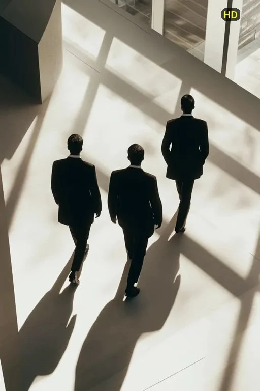
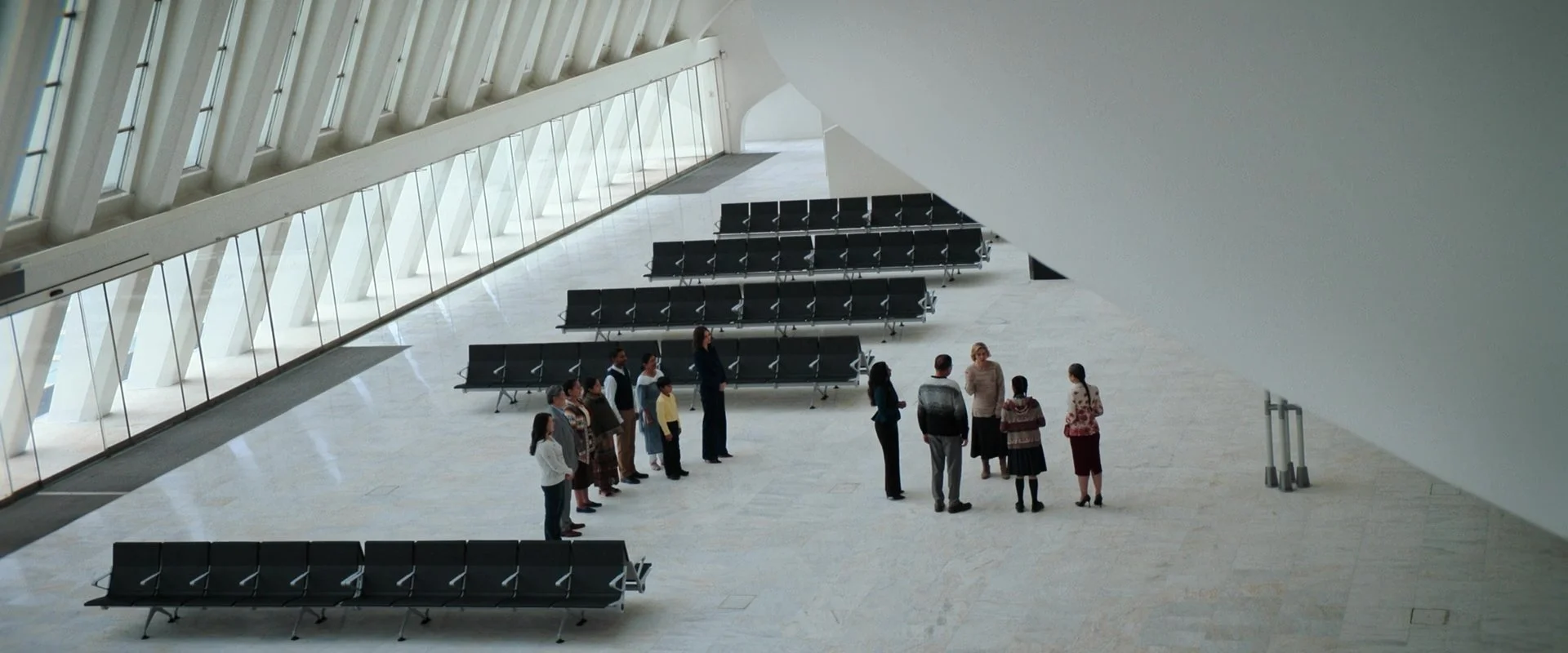
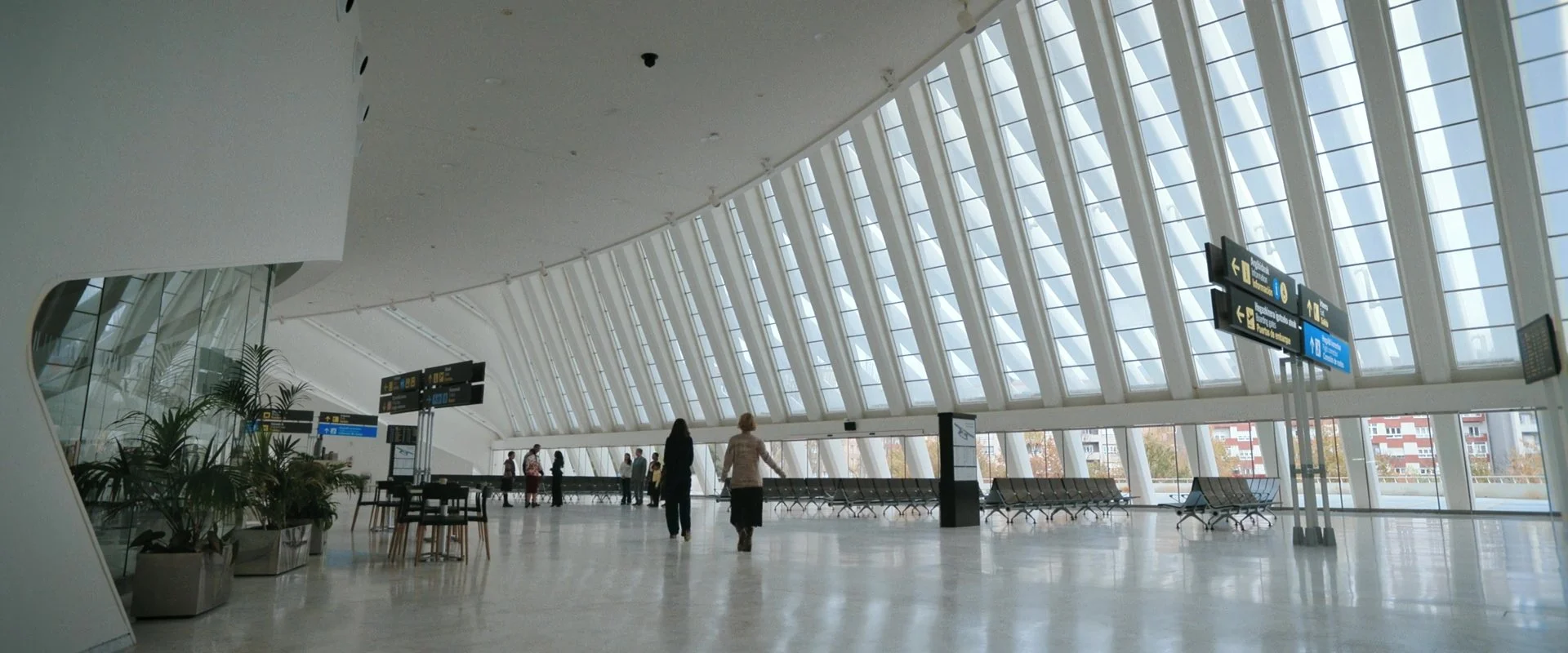
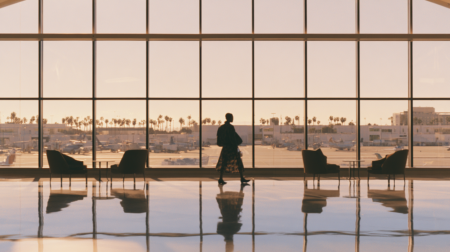
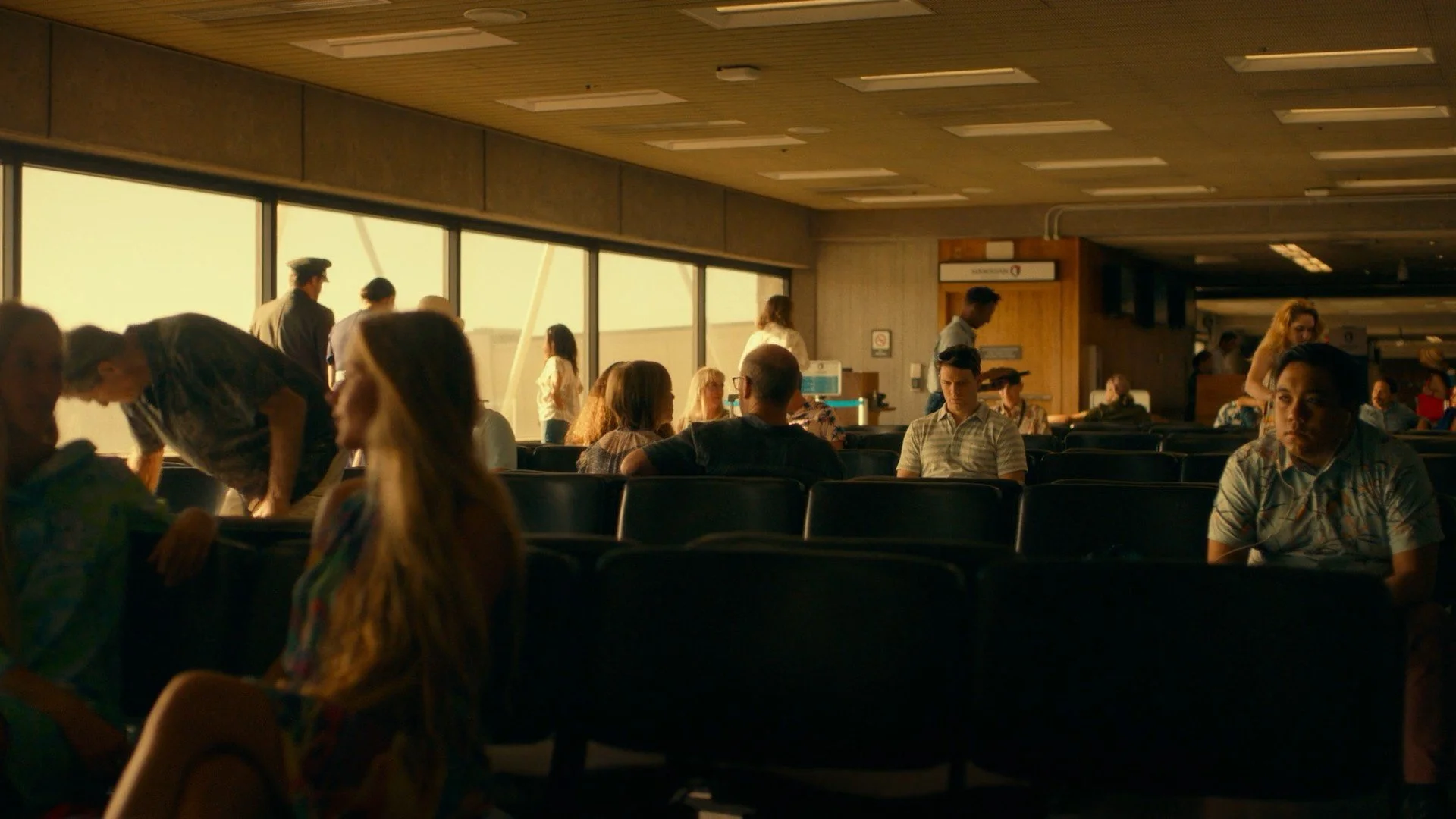
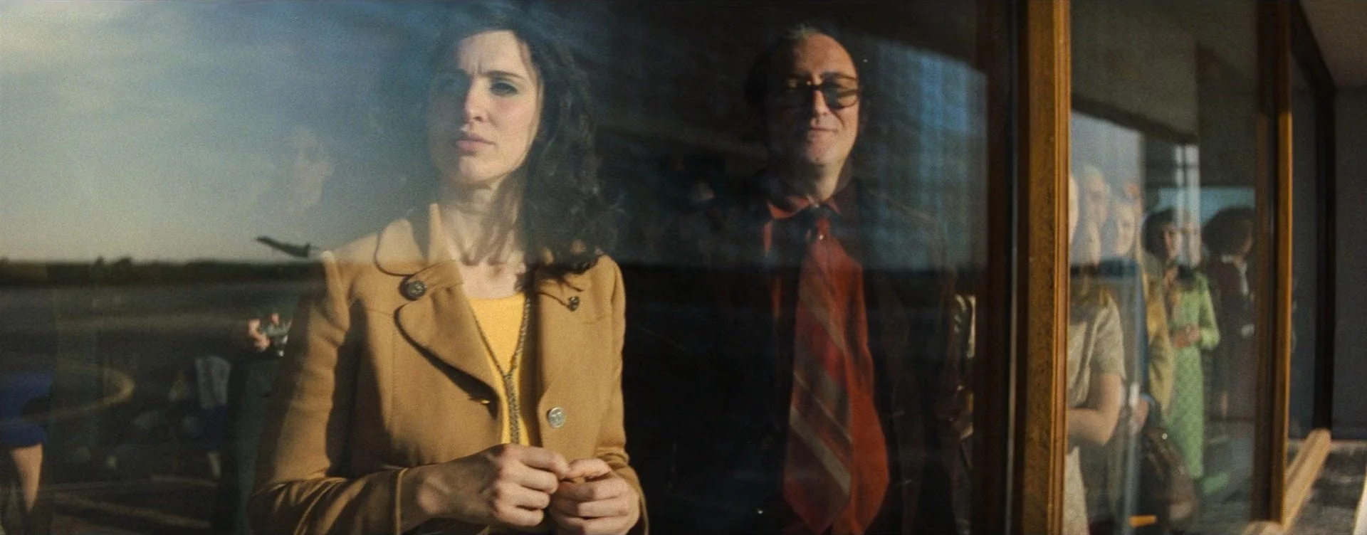
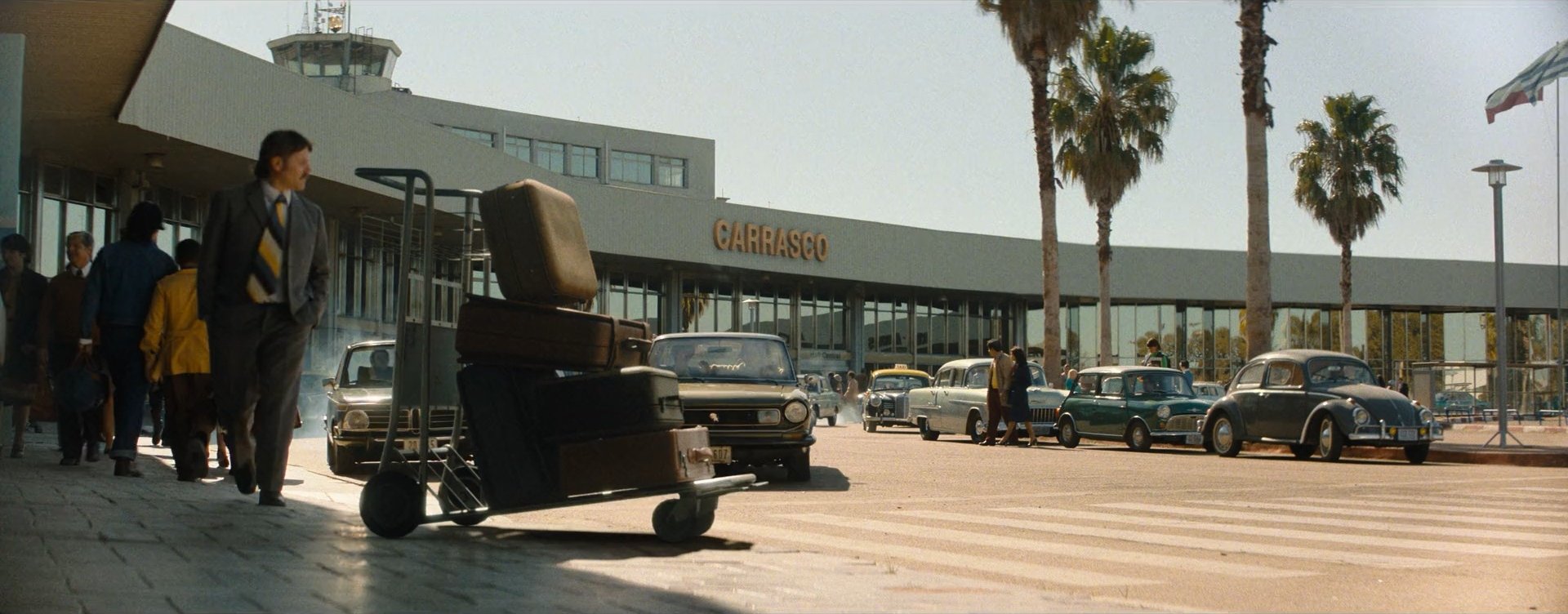
Find or create locations that are clean and graphic and allow for sun drenched environments and warmly lit interiors that can be dressed or extended in post to look like an airport.
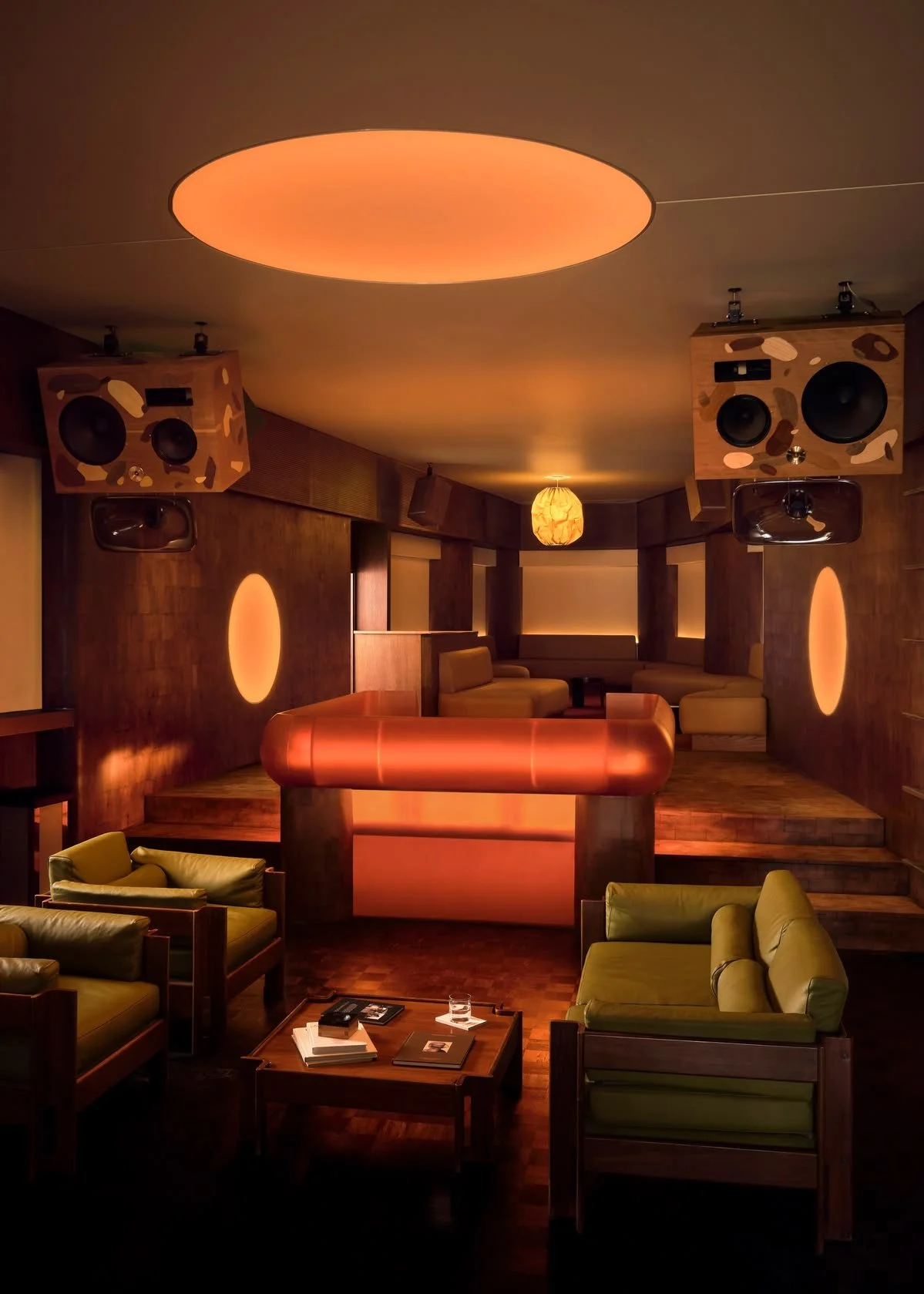
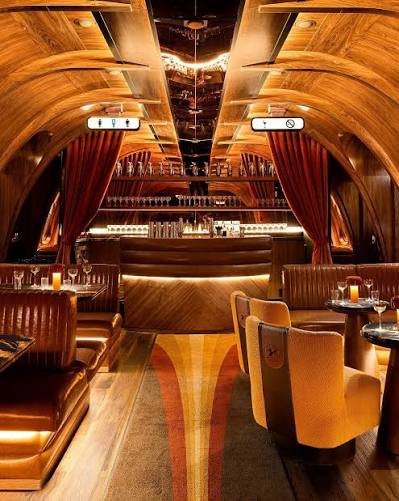
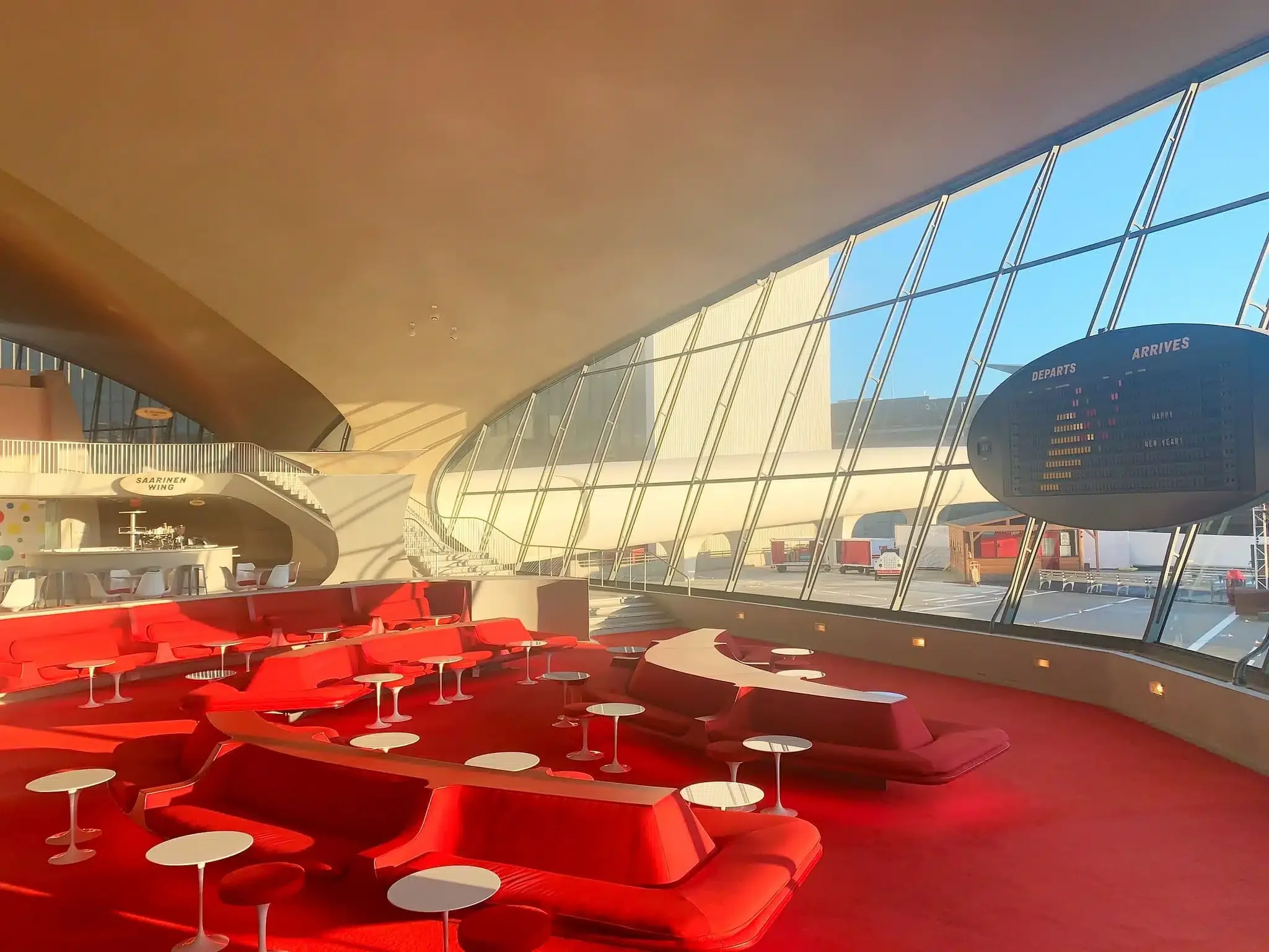
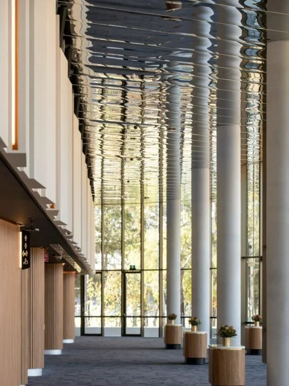
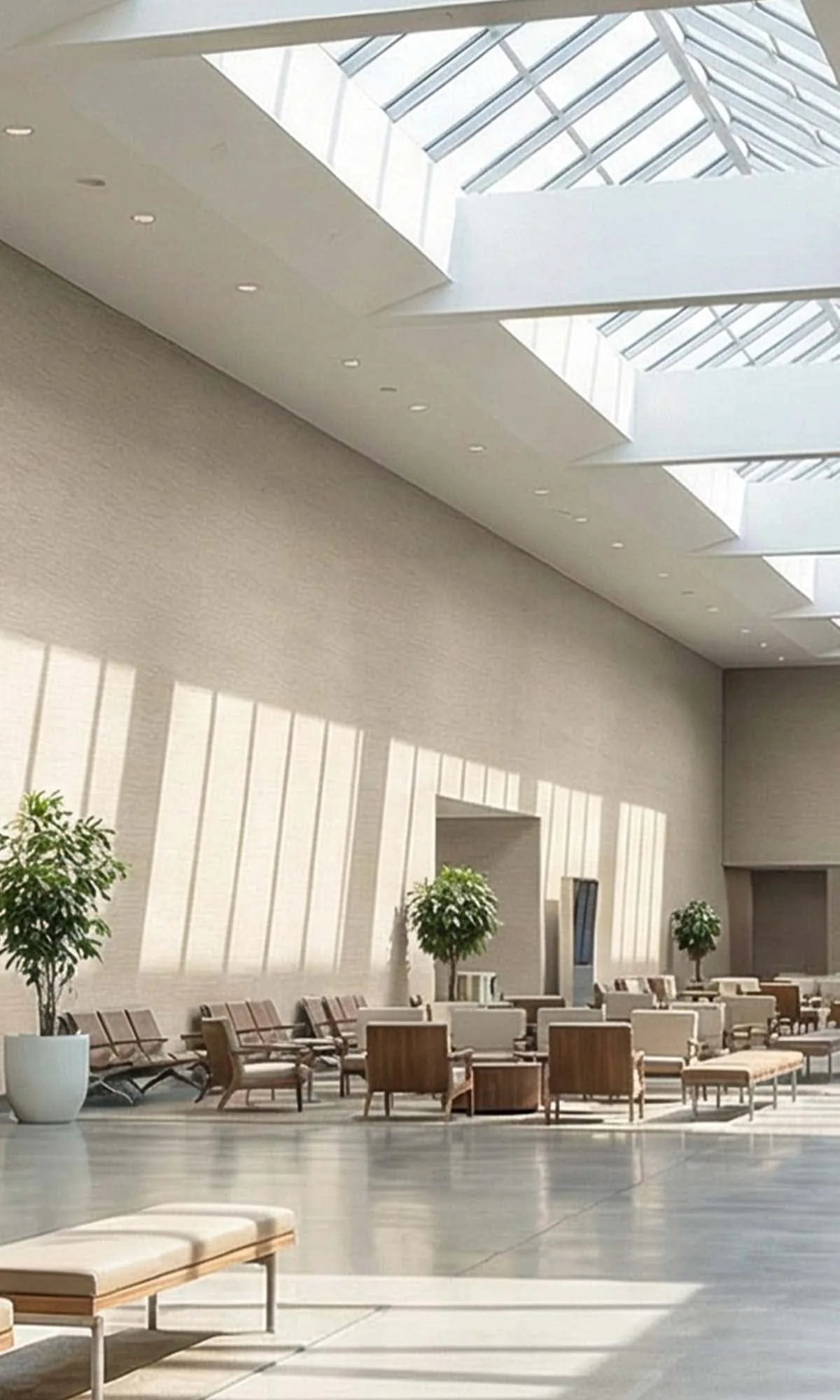
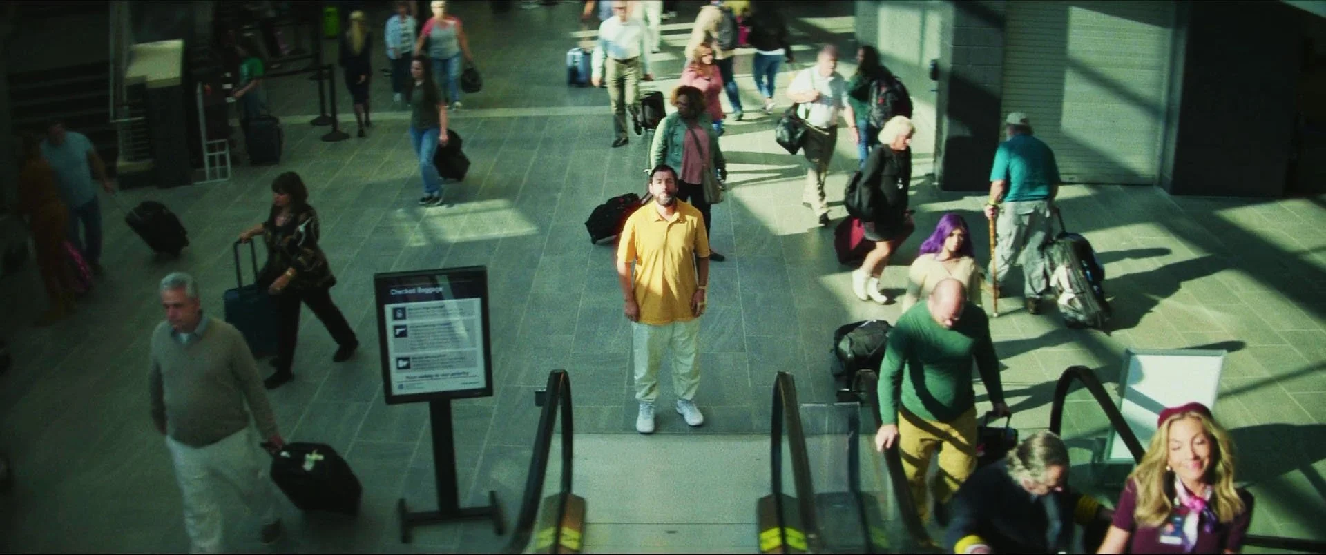
The LAX Airport can be constructed from a mixture of real locations (airports or not) and simple/small sets designed to match the visual language of the movie
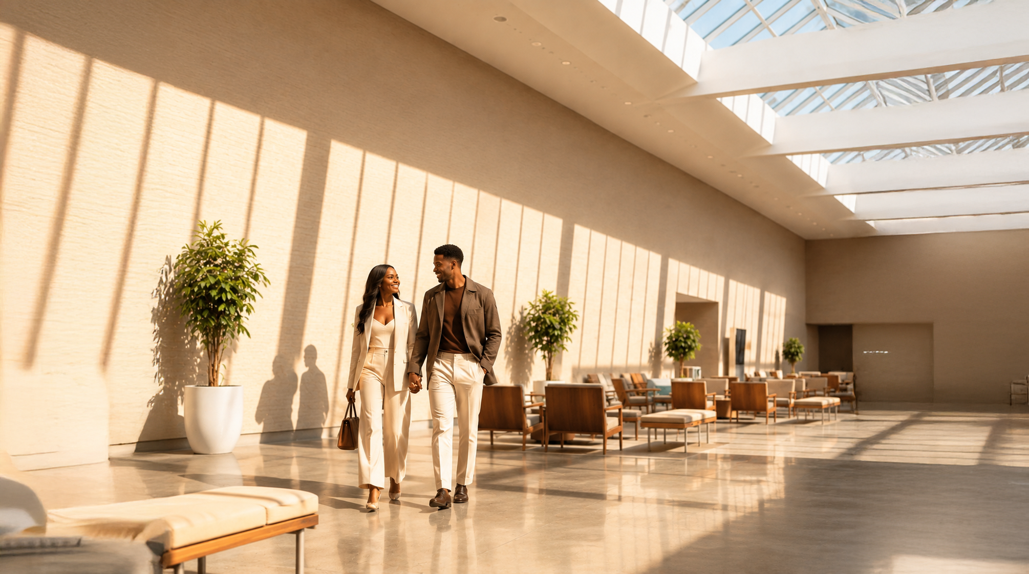
this could be a mall, or a conference center
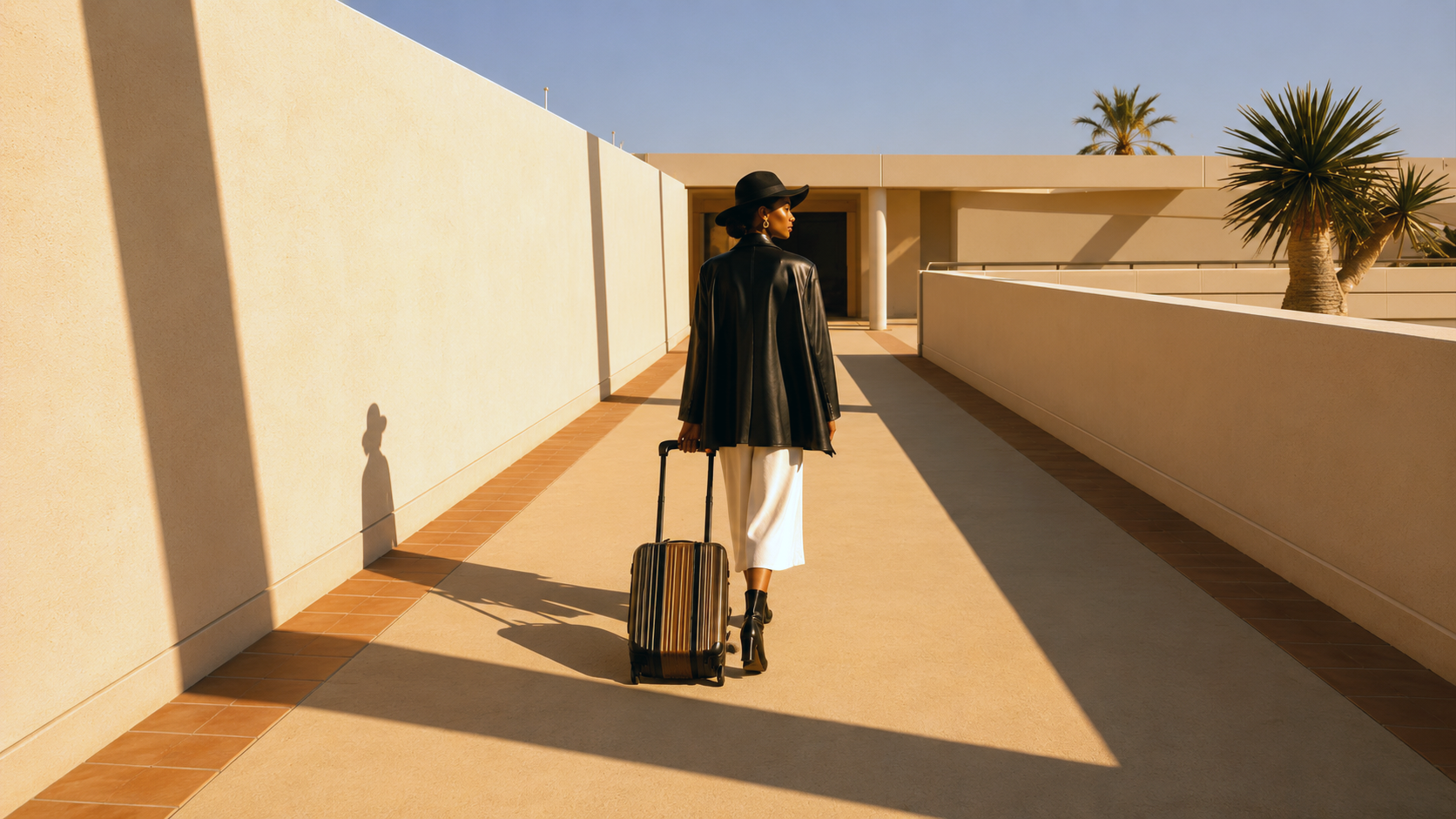
a parking lot can stand in for a walkway or entrance to terminal
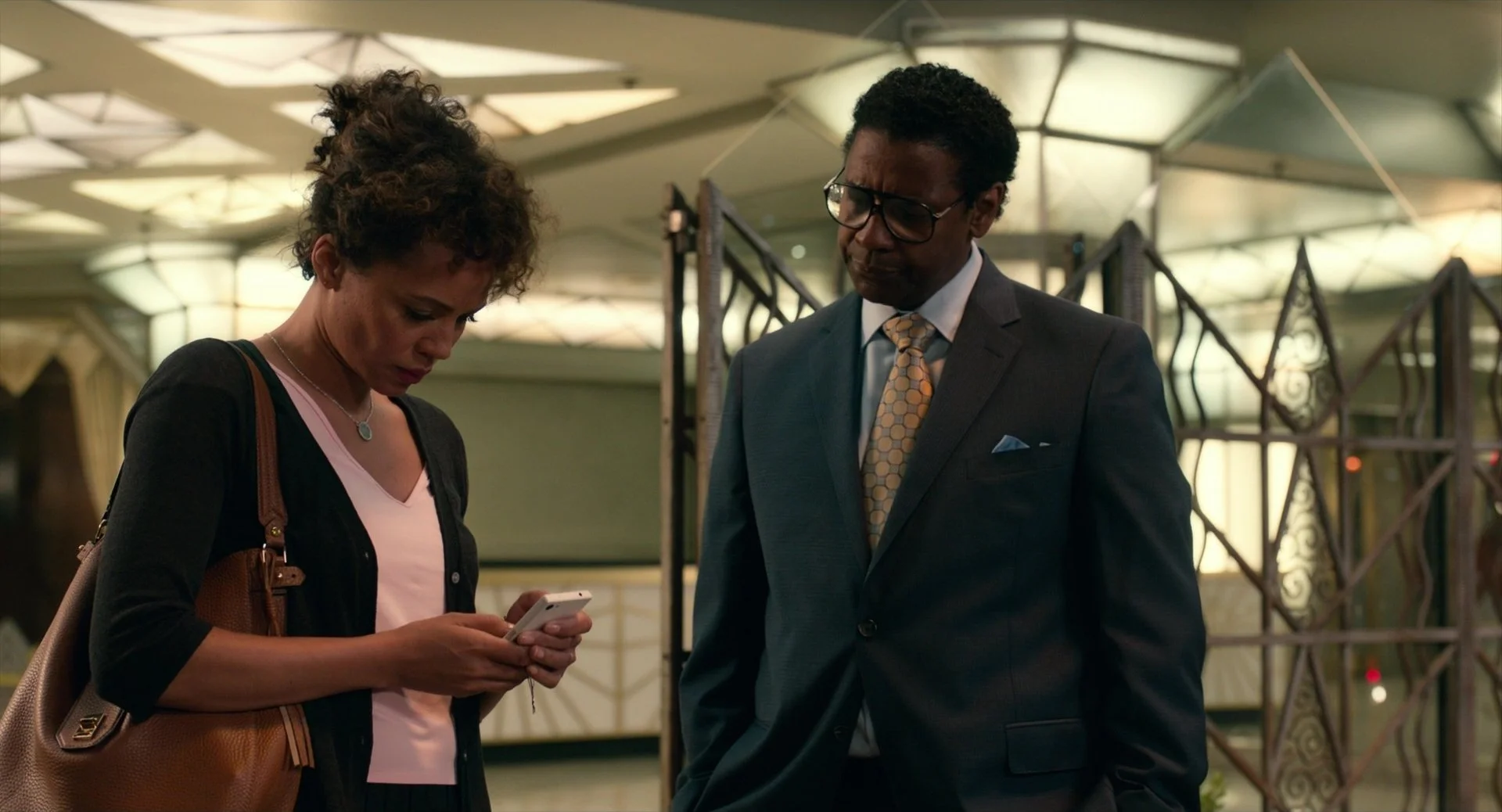
REFERENCES FROM MOVIES:
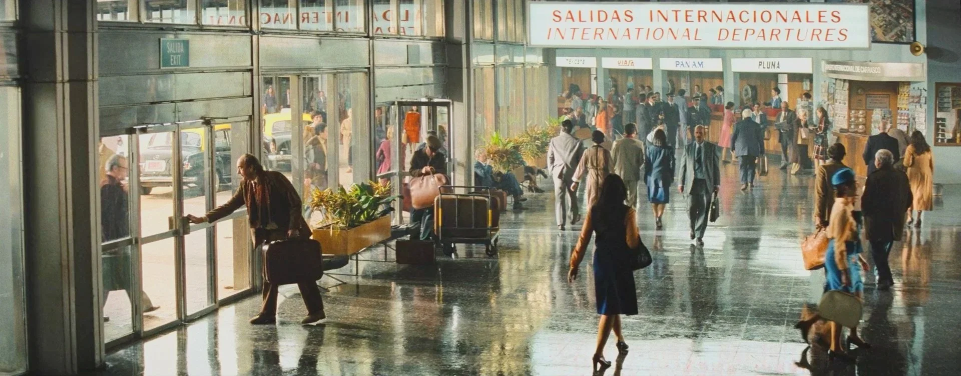
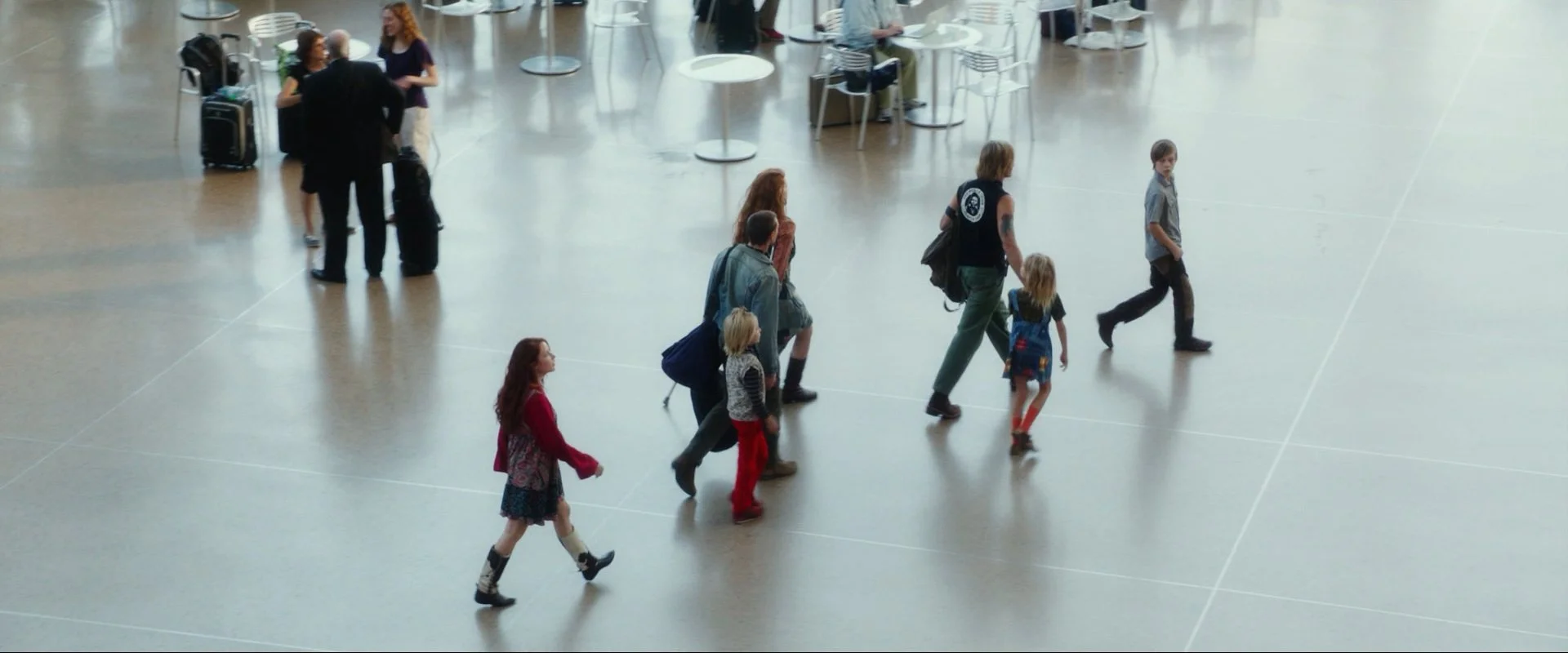
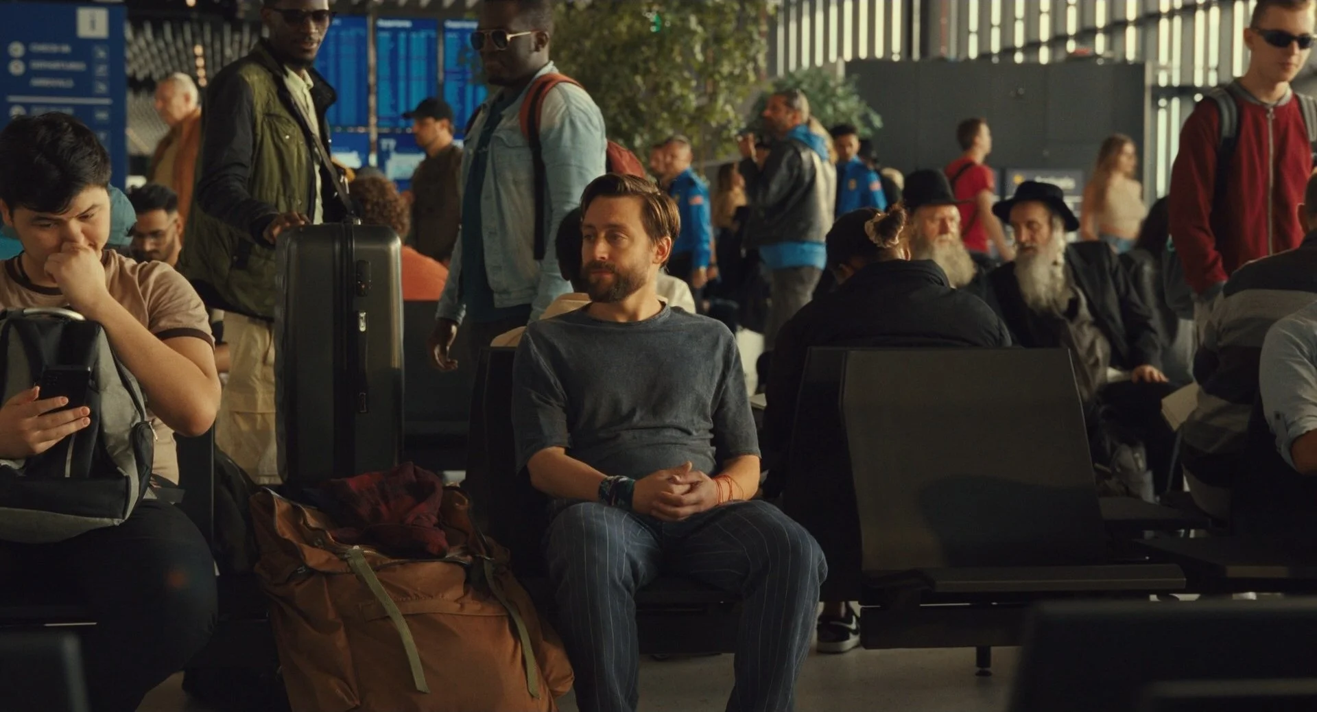
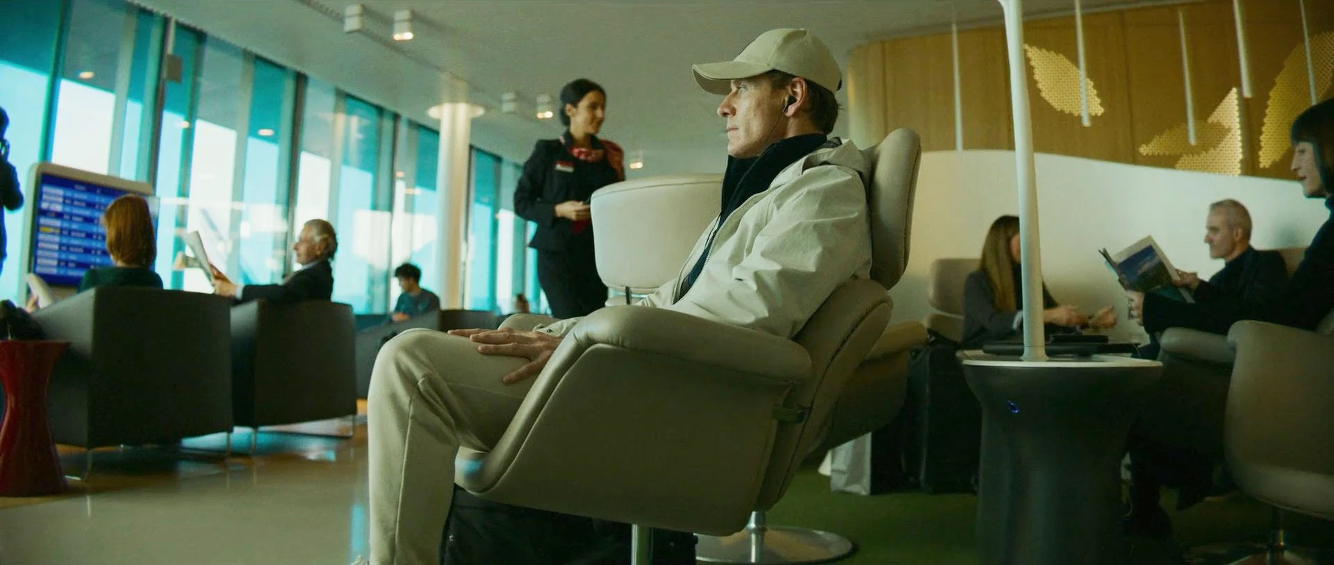
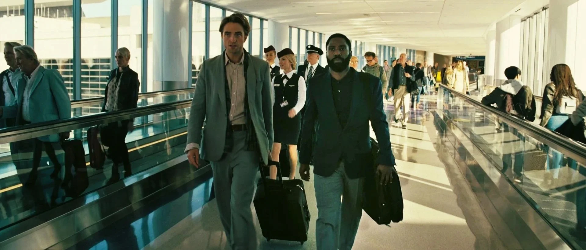
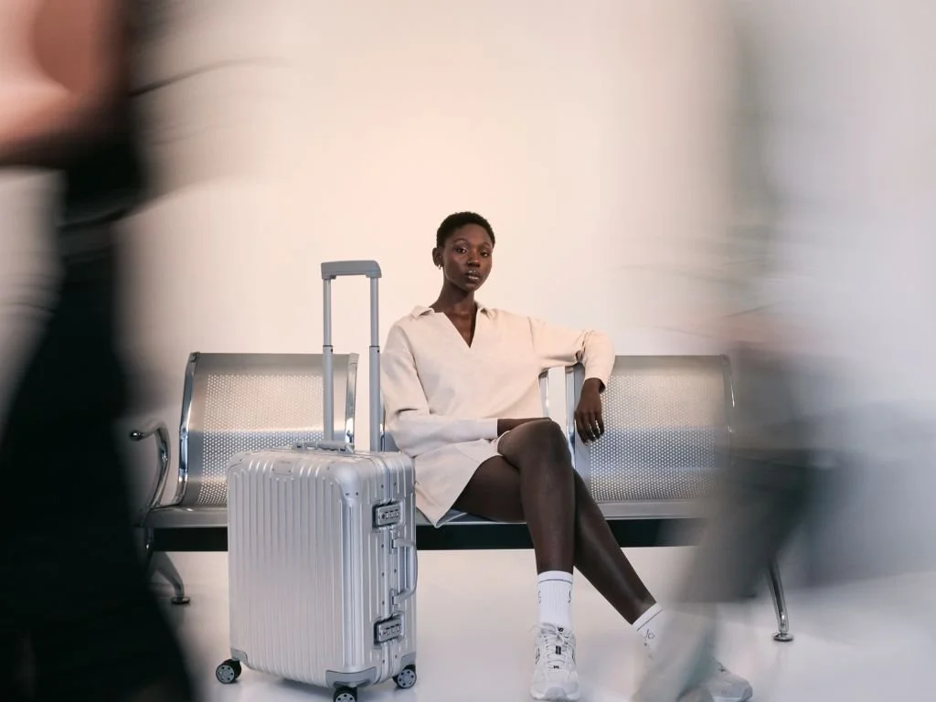
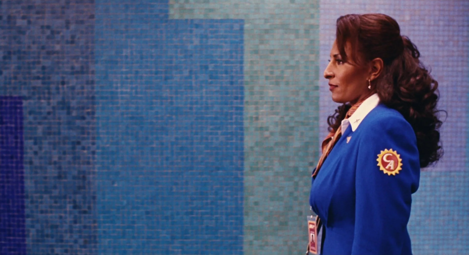
SIMPLE BACKGROUNDS
A simple wall with the right background and sunlight direction can be used as a transition shot: